2016 Postmortem
Related: About this forumThe past 20 years have been the best economic times in American history
Last edited Fri Mar 11, 2016, 01:37 AM - Edit history (1)

Manufacturing output is up

Real personal income is still recovering from 2008 but is much higher than it was in, say, 1993, largely because:

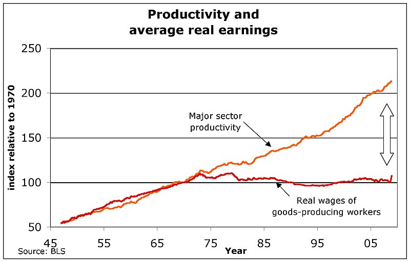
Starting just after 1993 real wages started going up again after two decades of stagnating. Even in manufacturing, wages are up, fairly sharply since 1993 in fact:

Although manufacturing has been bleeding jobs since WWII or so, falling from 1/3rd of all employment to about 1/10th:


BTW feel free to look up your own data series here:
https://research.stlouisfed.org/fred2/
FRED is a great resource.
EDIT: also good catch by think: household debt has been falling since 2008 (unfortunately FRED's numbers only go back that far)

 = new reply since forum marked as read
Highlight:
NoneDon't highlight anything
5 newestHighlight 5 most recent replies
= new reply since forum marked as read
Highlight:
NoneDon't highlight anything
5 newestHighlight 5 most recent replies
alcibiades_mystery
(36,437 posts)
Scootaloo
(25,699 posts)
Recursion
(56,582 posts)Notice the wages chart goes back to the golden age of the 1950s. When people made much less money, adjusted for inflation, than they do now.
Jitter65
(3,089 posts)bing mis-led. 

EmperorHasNoClothes
(4,797 posts)Do they still look the same?
Recursion
(56,582 posts)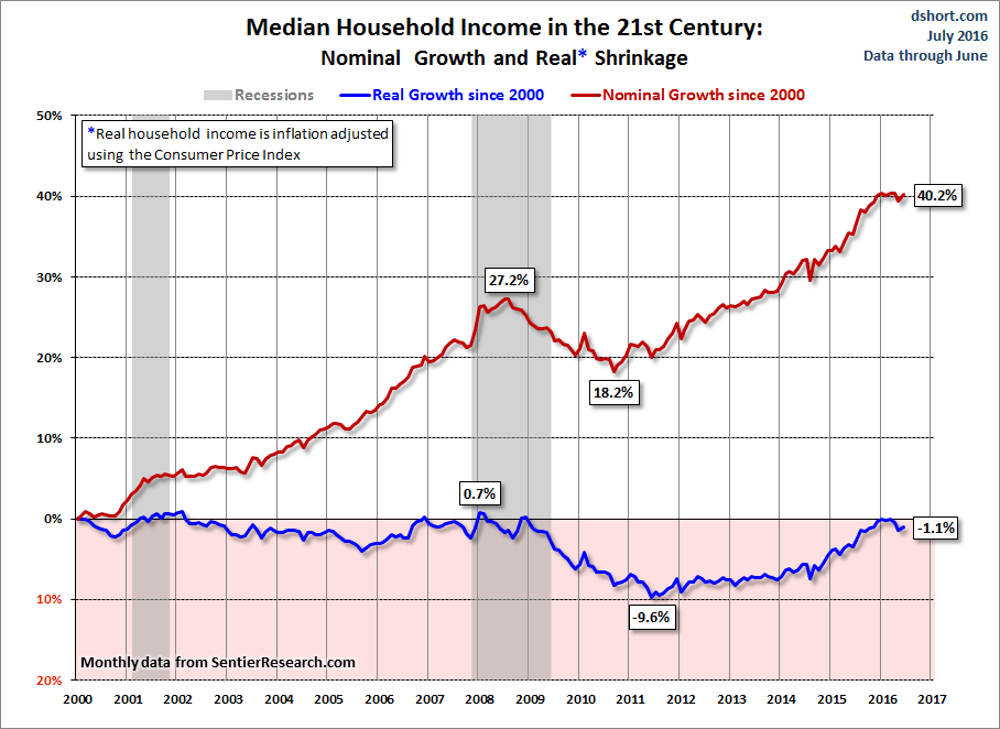
Recursion
(56,582 posts)In fact, you started at the end of the fastest income increase period in US history (1994-2000) and right before a recession.
"Better" yet you used a chart that tracks growth rather than the actual income. Classy 
Human101948
(3,457 posts)
Recursion
(56,582 posts)And it didn't render.
Human101948
(3,457 posts)Your graphs prove that someone has just had the best 20 years, but it wasn't the 99 percent.


BernieforPres2016
(3,017 posts)But that's the last time I'm looking at your bullshit propaganda.
Recursion
(56,582 posts)
Nice to know that's "bullshit propaganda" to you.
Do you have some data saying real median incomes or wages are down? Or are you just angry that the narrative you've convinced yourself of doesn't actually stand up?
CorkySt.Clair
(1,507 posts)If it doesn't fit the narrative it is to be condemned, discredited.
GoneFishin
(5,217 posts)hurting compared to their earlier situations. So they are playing games with the numbers in some substantial respect.
Agschmid
(28,749 posts)Armymedic88
(251 posts)Idk how old you are sir or how much money you make and frankly idc... but your not a Democrat!!! And yes im playing gate keeper, to many people are struggling in those economy to say things are going good!! Buh bye!!

noiretextatique
(27,275 posts)I doubt they will agree with your charts.
Recursion
(56,582 posts)In fact it's down by about 50%.
People really have trouble letting go of false narrative sometimes.

azurnoir
(45,850 posts)Recursion
(56,582 posts)
azurnoir
(45,850 posts)those usually clarify the bald numbers

wryter2000
(46,051 posts)When they much prefer fiction.
Recursion
(56,582 posts)wryter2000
(46,051 posts)Remind me. 
Recursion
(56,582 posts)My wife cynically says "of course they were never worn; babies don't walk."
Anyways, the back-story is that Hemingway said a good writer could come up with an emotional story in six words, and he came up with "Baby shoes, for sale. Never worn"
A late and more cynical sci-fi writer camer up with the six-word sci-fi classic:
"Baby shoes, for sale: IN SPACE"
wryter2000
(46,051 posts)I knew that.
I didn't have kids, but I'm pretty sure babies wear shoes before they walk. I'll bet people buy shoes for the baby before it's born.
nadinbrzezinski
(154,021 posts)people get that impression.
Over the last 10 years, productivity is up, actually since 2000, wages, are flat. This is not a false narrative, it is reality. Want those charts too? Here you go... and my error, I forgot the decoupling started in 1975, my error.

Lucinda
(31,170 posts)Much appreciated. 
PowerToThePeople
(9,610 posts)Recursion
(56,582 posts)Which means, half of the country. The problem with median charts is they don't tell you how distributed the money is above and below; just that half make less and half make more.
PowerToThePeople
(9,610 posts)That are "adjusted for inflation" highly questionable if not completely inaccurate.
Recursion
(56,582 posts)
Fine, then you should be happy with the $0.75 per hour, right? Since inflation is apparently a myth?
PowerToThePeople
(9,610 posts)Recursion
(56,582 posts)FOOD AND BEVERAGES (breakfast cereal, milk, coffee, chicken, wine, full service meals, snacks)
HOUSING (rent of primary residence, owners' equivalent rent, fuel oil, bedroom furniture)
APPAREL (men's shirts and sweaters, women's dresses, jewelry)
TRANSPORTATION (new vehicles, airline fares, gasoline, motor vehicle insurance)
MEDICAL CARE (prescription drugs and medical supplies, physicians' services, eyeglasses and eye care, hospital services)
RECREATION (televisions, toys, pets and pet products, sports equipment, admissions);
EDUCATION AND COMMUNICATION (college tuition, postage, telephone services, computer software and accessories);
OTHER GOODS AND SERVICES (tobacco and smoking products, haircuts and other personal services, funeral expenses).
Also included within these major groups are various government-charged user fees, such as water and sewerage charges, auto registration fees, and vehicle tolls. In addition, the CPI includes taxes (such as sales and excise taxes) that are directly associated with the prices of specific goods and services. However, the CPI excludes taxes (such as income and Social Security taxes) not directly associated with the purchase of consumer goods and services.
The CPI does not include investment items, such as stocks, bonds, real estate, and life insurance. (These items relate to savings and not to day-to-day consumption expenses.)
For each of the more than 200 item categories, using scientific statistical procedures, the Bureau has chosen samples of several hundred specific items within selected business establishments frequented by consumers to represent the thousands of varieties available in the marketplace. For example, in a given supermarket, the Bureau may choose a plastic bag of golden delicious apples, U.S. extra fancy grade, weighing 4.4 pounds to represent the Apples category.
What do you think it's leaving out?
azurnoir
(45,850 posts)What are some limitations of the CPI?
The CPI is subject to both limitations in application and limitations in measurement.
The CPI may not be applicable to all population groups. For example, the CPI-U is designed to measure inflation for the U.S. urban population and thus may not accurately reflect the experience of people living in rural areas. Also, the CPI does not produce official estimates for the rate of inflation experienced by subgroups of the population, such as the elderly or the poor. (BLS does produce and release an experimental index for the elderly population; however, because of the significant limitations of this experimental index, it should be interpreted with caution.)
As noted in the answer to question 19, the CPI cannot be used to measure differences in price levels or living costs between one place and another; it measures only time-to-time changes in each place. A higher index for one area does not necessarily mean that prices are higher there than in another area with a lower index. It merely means that prices have risen faster in the area with the higher index since the two areas' common reference period.
The CPI cannot be used as a measure of total change in living costs because changes in these costs are affected by factors (such as social and environmental changes and changes in income taxes) that are beyond the definitional scope of the index and so are excluded.
http://www.bls.gov/cpi/cpifaq.htm#Question_21
Limitations in measurement
Recursion
(56,582 posts)The problem for applicability to rural areas is that almost everything is much, much cheaper.
azurnoir
(45,850 posts)and tell them it's all their imaginations that prices of consumer goods outside of housing seem higher
Recursion
(56,582 posts)I know some groceries are, but most durables seem to be significantly cheaper than they were 20 years ago. Even in nominal terms.
azurnoir
(45,850 posts)the post that spawned this subthread was specific to, and that includes durable goods such appliances ect with the exception of some electronics such as TV's and PC's
Arazi
(6,829 posts)and durable goods
Energy costs are also typically higher as many rural homes are on propane or oil and fuel costs are up there as well. Electricity is also much higher
Just a couple items off the top of my head
Recursion
(56,582 posts)Namely, that when gas prices collapse like they have recently, it pulls the entire CPI down even for those of us who don't drive much (but then again we buy stuff that comes in on trucks that have to be gassed up, so...)
But, yeah, I'll grant that for the 18% of the population that lives outside of an urban or suburban area, gas is a bigger expense than for other people.
Arazi
(6,829 posts)Recursion
(56,582 posts)However, the house with that well cost $50K as opposed to $500K. People move out of cities, among other reasons, because it's in general cheaper to live out there.
Arazi
(6,829 posts)you take mass transit, we pay the expenses of owning and maintaining vehicles.
I'll grant you the housing is cheaper but we pay more in other monthly/daily ways like gas, propane, electricity etc.
There's no cable here, no wifi - accessing those things is much more expensive for rural folks. Hell, the only cell phone service that has connectivity is almost always the most expensive plan
I'm just talking off the top of my head here and it's late. Sorry I don't have anything but anecdotes. Maybe tomorrow I'll try to pull some hard numbers
Great OP! Thanks
PowerToThePeople
(9,610 posts)that I have much knowledge about.
I would guess that regional price differences play a large factor in it's accuracy or inaccuracy.
Armstead
(47,803 posts)Prices go up, containers get smaller, and often ingredients get cheaper.
problem with charts and lists -- IMO -- is they consolidate too much data. It might be useful for overall trends but not the reality on the ground for average people.
Like you can buy cheap food in a Dollar Store, but it's not really food.
nadinbrzezinski
(154,021 posts)think
(11,641 posts)
OCTOBER 9, 2014
Following the better-than-expected September jobs report, several economic analyses have pointed out the continuing lack of meaningful wage growth, even as tens of thousands of people head back to work. Economic theory, after all, predicts that as labor markets tighten, employers will offer higher wages to entice workers their way.
But a look at five decades’ worth of government wage data suggests that the better question might be, why should now be any different? For most U.S. workers, real wages — that is, after inflation is taken into account — have been flat or even falling for decades, regardless of whether the economy has been adding or subtracting jobs.
Cash money isn’t the only way workers are compensated, of course — health insurance, retirement-account contributions, education and transit subsidies and other benefits all can be part of the package. But wages and salaries are the biggest (about 70%, according to the Bureau of Labor Statistics) and most visible component of employee compensation.
According to the BLS, the average hourly wage for non-management private-sector workers last month was $20.67, unchanged from August and 2.3% above the average wage a year earlier. That’s not much, especially when compared with the pre-Great Recession years of 2006 and 2007, when the average hourly wage often increased by around 4% year-over-year. (During the high-inflation years of the 1970s and early 1980s, average wages commonly jumped 8%, 9% or even more year-over-year.)...
Source:
http://www.pewresearch.org/fact-tank/2014/10/09/for-most-workers-real-wages-have-barely-budged-for-decades/
think
(11,641 posts)
On Tuesday morning, the United States Census Bureau released its annual report on income and poverty in the United States. Ostensibly, it didn’t contain many news-grabbing headlines. In 2013, the number of people living in poverty edged down a bit—from 46.5 million, in 2012, to 45.3 million—and the median household income edged up a bit—from $51,800 to $51,900. (The income figures are adjusted for inflation.)
These developments were positive. The poverty rate fell from fifteen per cent to 14.5 per cent, and the Gini coefficient for equivalence-adjusted income, a measure of over-all household-income inequality that takes into account the number of people in each household, also fell a bit. But all of the changes were minor. In fact, the changes in the median household-income figures and in the number of people in poverty weren’t statistically significant. (In a separate release, which was a headline grabber, the Census Bureau reported that the number of people without health insurance fell by 3.8 million in early 2014, after the Affordable Care Act extended coverage to many new people. Health experts said that the figure actually understated the impact of the A.C.A., probably because the government survey concluded in March.)
The median household is the one right in the middle of the income distribution, and any sign of it doing better, even a bit better, is welcome. Both the uptick in the median income and the fall in the poverty rate reflect the economy’s steady, if unspectacular, recovery from the Great Recession, which hit low- and middle-income people particularly hard. As the recovery continues, more modest gains can be expected.
But there the good news stops. Even in cyclical terms, there is a long way to go before ordinary Americans are able to recover the losses that they suffered during the recession. Median household income was eight per cent lower in 2013 than it was in 2007, when the recession began. And the poverty rate in 2013 was two percentage points higher than it was in 2007...
Read more:
http://www.newyorker.com/news/john-cassidy/chart-explains-american-politics
Recursion
(56,582 posts)Even W's disastrous mangling of the economy couldn't wipe out all of the gains we made during the Clinton years.
And, again, notice the gains since 1993 are larger than the gains up to 1993.
think
(11,641 posts)That's the problem right there.
But you're focused on some 20 year meme. If you want to say the Clinton 90's era was good so be it.
But the last 8 years have really sucked. And that's the reality that the American people are facing. The 20 year period means nothing at this point in time. The political reality is that wages are down, good jobs with benefits are hard to find, the cost of education has sky rocketed, debt levels for Americans have risen, and savings have been exhausted for those who've been hit hard by the recession.
Blaming George Bush doesn't cut it. The fundamentals have changed or the incomes would have gone back up. Instead wealth inequality is at it's highest since the great depression:
http://www.csmonitor.com/USA/USA-Update/2014/1110/Economic-inequality-in-the-US-reaches-levels-not-seen-since-Great-Depression
If these things aren't addressed that 20 year window you tout doesn't mean jack. Don't get me wrong I'm glad you're doing OK. But for a great many Americans that 8% drop in income in the last 8 years has been devastating.
Recursion
(56,582 posts)However:
debt levels for Americans have risen
Nope. They've been falling since 2008.
https://research.stlouisfed.org/fred2/series/HDTGPDUSQ163N
I looked at 20 years because that's roughly the "post-NAFTA period", and a lot of people are talking about NAFTA.
Bluenorthwest
(45,319 posts)Nov 2015:
"Household borrowing in the U.S. climbed to its highest level since 2010 in the third quarter, driven by increases in mortgage lending, auto loans, student loans and credit cards, according to the New York Federal Reserve.
Household debt climbed by $212 billion to $12.07 trillion. Mortgage debt surged $144 billion, marking the second biggest rise since 2007. And mortgage originations rose to $502 billion, the highest in nearly two years."
http://www.cnbc.com/2015/11/19/new-york-fed-household-debt-at-highest-level-since-2010.html
People Over 50 Carrying More Debt Than in the Past
The average 65-year-old borrower has 47% more mortgage debt than those in 2003
Older Americans are burdened with unprecedented debt loads as more and more baby boomers enter what are meant to be their retirement years owing far more on their houses, cars and even college loans than previous generations.
http://www.wsj.com/articles/new-york-fed-finds-large-increase-in-debts-held-by-those-over-age-50-1455289257
Dem2
(8,168 posts)
It's only 1% lower as of the end of 2015, we will exceed 2007 very soon.
think
(11,641 posts)I'm not saying the numbers are wrong. Only that I don't know the source nor where they got their data.
Thank you in advance for any information you can add to validate your chart's numbers.
Dem2
(8,168 posts)It leads to this page: http://www.advisorperspectives.com/dshort/
Which has a shit-ton of up-to-date data, mostly in the form of charts.
I decided to bookmark it for future reference.
think
(11,641 posts)Only that it would be nice to see whose data their numbers for this chart are based on.
Dem2
(8,168 posts)They go into decent detail about the data used in the chart there.
Also, here's a relative change chart that shows that we're near parity at this time (relative to 2000.)
think
(11,641 posts)Recursion
(56,582 posts)$779 weekly earnings in 1979 vs $820 today (using 2016 dollars)
think
(11,641 posts)Recursion
(56,582 posts)than the legend says.
However, the BLS data you can look up for yourself.
Ken Burch
(50,254 posts)How does that work compared to the price increases on everything since then?
And could that possibly justify the huge numbers of people who took pay cuts, benefit cuts(or losses), or mass layoffs, while a handful of those at the top lived like Roman emperors.
Recursion
(56,582 posts)
"Real" means adjusted for price increases. FFS. This isn't difficult.
Logical
(22,457 posts)Recursion
(56,582 posts)But I just pulled the BLS numbers for nonfarm non-supervisory weekly income. Though then again I think theirs was hourly, which might well be different from weekly if hours worked changed.

ucrdem
(15,512 posts)You wouldn't know it from noisy ODS crowd which is seamlessly transitioning to the noisy ABC crowd.
litlbilly
(2,227 posts)Ken Burch
(50,254 posts)The downsizing victims have never been made whole for the unjustified misery they were subjected to.
And the poor never deserved Bill letting the slurs on their collective character go unchallenged.
Or HRC calling people on welfare "deadbeats".
A lot of wounds need to be healed. A lot of apologies need to be made.
None of the good justifies the harm that was done to millions of innocent people.
Major Hogwash
(17,656 posts)What did you do, erase those 8 years?
Hahahahahaha!!!!!!!!!!!!!!

Recursion
(56,582 posts)Even W's disastrous mishandling of the economy couldn't erase all the gains of the Clinton years.
Major Hogwash
(17,656 posts)Zero economists agree with you.
Response to Major Hogwash (Reply #39)
polly7 This message was self-deleted by its author.
Major Hogwash
(17,656 posts)Thank you, very much.

polly7
(20,582 posts)years can even try to deny what's happening.
Recursion
(56,582 posts)If I'm objectively making more money than I was 20 years ago, I'm still better off, even if somebody else is making even more money.
polly7
(20,582 posts)Recursion
(56,582 posts)Inflation adjusted wages and incomes are up, not steady or down, in the post-NAFTA era. By a greater amount than they went up in the same time period before NAFTA.
polly7
(20,582 posts)Recursion
(56,582 posts)And have been for decades, under administrations of both parties? And nobody has ratted them out?
That seems pretty unlikely to me. What makes you think that?

dana_b
(11,546 posts)In the 50s, 60s through to about the mid 80s, there were a lot more union jobs, people could afford to buy a home, college was free (until REAGAN got his grubby paws on it here in California), people could live one one income, a lot less bankruptcy and people didn't live on credit cards. Jobs could be had for 20-30 years with retirement and pensions. Those jobs are GONE!!
I swear what you posted sounds like what a Republican would say in order to defend the b.s. shift of wealth to the top 1-5% of the country. Very, VERY out of touch.
Lorien
(31,935 posts)My grandfather raised FOUR kids and put them ALL through college (good ones) on his lower end middle class salary from an Akron tire company. They had a comfortable newer custom built home, plenty of land for an orchard and huge vegetable garden, and always had a late model mid range vehicle. My grandmother never needed to work. They took three week family vacations out West every year. He went camping and fishing on the weekends at a private club. They never struggled with medical bills. They retired with plenty of savings, traveled to Europe, Australia, New Zealand, and Hawaii. They never had too much or too little. Lower end middle class workers today would struggle to do the same on TWO salaries! They wouldn't retire with a good pension and a gold watch, either! Hell, I don't make as much today as I did 20 years ago; the work just isn't out there anymore, and when it is, employers aren't paying as much for it. ALL of the gains have gone to the top 0.01%. Anyone who says otherwise is flat out lying!
Recursion
(56,582 posts)Unpack that:
What kind of job could your grandmother have gotten? Would it have paid to raise four kids and a husband?
In the 1970s, women and minorities started entering the professional workforce on something approaching parity with white men (though they're still not there yet) and so white male wages fell because the workforce tripled in size.
That's part of the problem I have with the "wage stagnation" narrative to begin with: it's specifically a white male experience; women and minorities have seen enormous wage and income gains over the same period.
Lorien
(31,935 posts)I lived through the 70s, and I doubt that you were even born yet.
Read some Thomas Piketty or Robert Reich and buy a f*cking clue.
Recursion
(56,582 posts)Wages for women and people of color are up. It's just arithmetic. If you have data showing otherwise, feel free.
I was alive in the 1970s. I've read Piketty and I read Reich all the time.
dana_b
(11,546 posts)and to top it off they will start out life with a mountain of college debt. Come on people - please, PLEASE vote for Bernie!! He's not magician but at least he will try.
It sounds like your grandparents had a nice life and so your parent probably started out with a secure life too. That's a tough thing to do these days. I know so many people, young and older, that have to work 2 jobs just to make ends meet. It's so disheartening and they get overwhelmed. Nah, I can't even listen to stuff like the OP because I don't need charts to tell me how "great" things are now. They're not! They are worse for my family and for so many families than they ever have been.

BeyondGeography
(39,374 posts)From the clip, which analyzes living standards for the typical family of four from 1970s to 2004, mortgages up 76 percent (inflation adjusted) for a median-sized house; health insurance up 74 percent; cars up 52 percent (because most families now have two);child care up 100 percent (because two incomes are needed to support a family of four); tax rates up 25 percent. Consumer goods are cheaper, necessities much more expensive. Then there's revolving debt; in 1970, the average family held 1.4 percent of debt relative to HHI. By 2005, it was 15 percent. It's all in the first 20 minutes or so of this Warren lecture:
Recursion
(56,582 posts)We've still got some more deleveraging to do, but it's moving in the right direction. Unlike in Canada and a lot of Europe.
dana_b
(11,546 posts)Job losses, downsizing, housing losses, bankruptcies, NO raises!!! It goes on, and on, and on.
Btw - regarding these charts -
I guess that I can tell my sister and her husband who had to declare bankruptcy and lost their home that it's okay because the charts say that they're doing better.
Let me tell my daughter's 25-27 year old friends who are working 2-3 part time jobs at minimum wage that they are actually doing great because these charts say so. My daughter has been at a store for five years and they give her a .25 raise a year as if that's going to do anything for her. Or maybe my nephew who was just laid off, again. Or my friend who had to go down to Costa Rica to train two Spanish speaking women to do her job right before they let her go that hey, things are great! Then she couldn't find a job at 58 years old (and she has a walker) for 3.5 years!! But she shouldn't fret because things are so much better now because the charts say so. Or even myself - I was laid off because they down sized our department and because I was working only 20 hours a week due to an injury, no one wanted to hire me so I went backwards on my health and haven't been able to work for 5 years! But hey - things are peachy because THE DAMN CHARTS SAY SO!!
No - your charts are crap. Period.

RiverLover
(7,830 posts)Its annoying to have to argue with conservatives here. All the time. And it isn't like he's the only one.
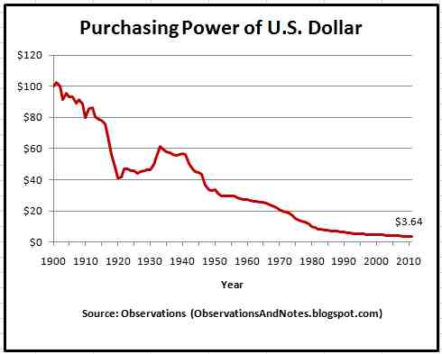
Here's another chart, not by Fred~

And when you consider purchasing power, you see why so many are struggling.

donco
(1,548 posts)so rosy then why does it take two working today to support a family?My dad supported our family(a family of 4) with his paycheck.
Recursion
(56,582 posts)What you're seeing is a drop in the wages and incomes of white males simultaneous with a pretty drastic increase in the wages and incomes of everyone else, which translates to a slight overall increase.

joshcryer
(62,276 posts)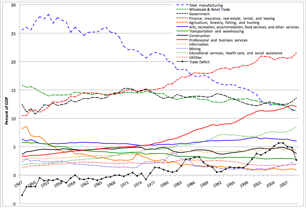
Rec for discussion. Not sure I feel like participating because you make good points but there is still a serious problem here. What's fascinating is that while manufacturing is on the rise seen against past performance, it's still nothing on the scheme of things. I expect manufacturing to slowly come back as automation takes over, but it won't bring back the jobs.

loyalsister
(13,390 posts)We have 3% unemployment and 19% poverty in my area. I think it's likely that the people who are working more than one job and trying to rase families would beg to differ.
Recursion
(56,582 posts)It's part of why so many people have left places like Youngstown for places like Houston. (I don't know where your area is, but the midwest has bled a lot of jobs to the rest of the country over this time period.)
loyalsister
(13,390 posts)People argue over whether we are the south or the midwest. Certainly parts of the state are southern, and the northern territory resembles the midwest more.
Being right in the middle we defy regional classification.
The problem with your numbers is the very callous way real people are converted into abstractions buried in a rosey chart. It reflects a cold blooded disregard for real pain people who grew up in middle class homes and find themselves living in poverty feel because of what it means for their kids when they see no end in sight to economic insecurity and worsening quality of life.
Cavallo
(348 posts)I don't get overtime and I'm not salaried. Nor are my coworkers who work long hours. We are replaceable in 1 minute, is the situation. The companies make that well known. I work in computers as a contractor which means I sit in a desk like an employee but my entire building is full of contractors and very few employees. I've worked at the current position for 2 years and can go on indefinitely as a contractor acting like an employee if I make sure I work way more than 8 hours every day. If I put overtime on my timesheet, I will be gone on the next pay cycle. If I don't stay late I will be replaced with someone who well. It's corporate america.
I don't believe any of the charts listed. I only see the standard of living going down with every single price raise at the grocery store and no wage raise to meet it. Just working longer for free.

6chars
(3,967 posts)I would rather operate based on reality than not reality. I do have a feeling there is more going on than these charts show. On the other hand, they are certainly part of the story. When our intuition doesn't align with the data we see, it is important to figure out why that is.
Recursion
(56,582 posts)But the opposite is true.
When our intuition doesn't align with the data we see, it is important to figure out why that is.
Very true.
6chars
(3,967 posts)H1) at the lower end things are worse than they have been.
H2) the frayed safety net is not reflected in what the data here measures
H3) expectations for a middle class life have risen, e.g., due to wide awareness of the lifestyles of the rich and famous, as well as all sorts of stories about what you should have, so people are falling farther behind expectations.
H3b) Even if things have gone up a bit for the middle class, most productivity gains have gone to the top 1/10th of 1%, and we see their increasing wealth and know we don't have it; even the gap between the top 1% or top 10% and the rest has grown.
H4) (sort of a mix of 1 & 2) there pockets of life where things are better and pockets where things are worse. Young people need a college degree more than before and it costs more than before, for example. A lot of people are in such pockets and they will know people in those pockets. Rents have gone way up in some cities, as have housing prices - which benefits those who are already owning and harms those not.
I do tell my kids not to be fatalistic about it. The country and the world is producing more as technology and connectedness improves. Hell, I can entertain myself with free music endlessly on Spotify compared to spending all my lawn mowing money for a couple of albums back in the day. But Spotify doesn't fill your belly or treat your cancer if you are left on the outside of this game.
Recursion
(56,582 posts)H2 is interesting, but there's no consistency in how government benefits are counted, unfortunately.
H4 is definitely true, and not just socially but geographically: the Sun Belt has done very well compared to the midwest. Lots of people left Youngstown for Houston.
Cheese Sandwich
(9,086 posts)12th straight year in a row! We are truly blessed!
deepestblue
(349 posts)Edit: (I originally erroneously posted a national debt chart, my bad).
OP, your consumer debt chart is a debt to GDP ratio.
Here's U.S. consumer credit from 1991 forward:

Recursion
(56,582 posts)And at any rate we've just seen the largest 8-year reduction in the Federal deficit ever, so we're moving in the right direction on that...

islandmkl
(5,275 posts)
UglyGreed
(7,661 posts)Americans would be devastated by a $500 car repair?????
http://www.cbsnews.com/news/most-americans-cant-handle-a-500-surprise-bill/
Recursion
(56,582 posts)UglyGreed
(7,661 posts)improving, so glad you agree 
Recursion
(56,582 posts)You'd have to ask what percent of Americans would be devastated by that now vs. 20 years ago.
Do you have those numbers?
UglyGreed
(7,661 posts)doing great and we should just stay the course. BTW I can say I never saw homeless people begging for food or living in a RV in the town I grew up in twenty years ago.............

libtodeath
(2,888 posts)as they keep a boot on our backs and necks.

Octafish
(55,745 posts)by Paul Buchheit
Published on Monday, December 01, 2014 by Common Dreams
Just 70 individuals now own as much wealth as half the world. In the U.S., the richest 40 individuals own as much as half the country, and the 16,000 American households in the top .01% have accumulated an average net worth of over a third of a billion dollars. As extreme wealth continues to grow out of control, inequality worsens for the rest of us, plaguing our country and our world, spreading like a terminal form of cancer. It should be a major news item in the mainstream media. But the well-positioned few are either oblivious to or uncaring about its effect on less fortunate people.
The data and charts (citations here) come from Forbes, Credit Suisse, and a recent study by Emmanuel Saez and Gabriel Zucman.
1. Just 70 Individuals Own As Much Wealth As Half the World

halftheworld.jpg
Less than a year ago, Oxfam reported that the richest 85 individuals owned as much wealth as half the world. But recently updated calculations reveal that the richest 70 individuals now own $1.842 trillion, more than the poorest half of the world.
We're drawing nearer to the fulfillment of Charles Koch's dream: "I want my fair share and that's all of it."
2. Just 40 Americans Own As Much Wealth As Half the United States

40americans.jpg
About a month ago it was 43, and a month before that it was 47. Now the richest 40 Americans (The Forbes 40) own a little over $1.092 trillion, about the same, according to calculations based on Credit Suisse data, as the poorest half of the country.
The national wealth that was created by all of us over many decades is quickly being redistributed to fewer and fewer incomprehensibly rich people.
One of the causes for this pathological transfer of wealth is revealed in the final image..
3. Stock/Equity Wealth of the Richest 12,000 Households Has Surpassed the Housing Wealth of 108,000,000 Households

stockequity.jpg
Just 35 years ago, the percentage of national wealth in middle-class housing (net of mortgages) was about seven times more than the percentage of national wealth in equities owned by the .01% (12,000 families). Now middle-class housing is only about half the value of those equities.
Saez and Zucman report that the total of corporate equities, bonds, and savings deposits owned by the .01% amounted to 2.2 percent of total U.S. household wealth in the mid-1980s, rising to 9.9 percent in 2012. Meanwhile, housing for the bottom 90% dropped from 15 percent of total household wealth to 5-6 percent. Since the bottom 50%, according to the authors, own almost zero wealth, the housing figures pertain to the 50-90% families, which can be described as "middle class."
Possible solutions are becoming clearer:
(1) A Financial Speculation Tax to slow down the flow of money to the takers
(2) Occupy Wall Street, Phase II
This work is licensed under a Creative Commons Attribution-Share Alike 3.0 License
Paul Buchheit is a college teacher, an active member of US Uncut Chicago, founder and developer of social justice and educational websites (UsAgainstGreed.org, PayUpNow.org, RappingHistory.org), and the editor and main author of "American Wars: Illusions and Realities" (Clarity Press). He can be reached at paul@UsAgainstGreed.org.
SOURCE w/links to details: http://www.commondreams.org/views/2014/12/01/slap-face-wealth-gap-images
UglyGreed
(7,661 posts)Oh and I just got an email this morning stating that over half of the children in NYS live in poverty....
cherokeeprogressive
(24,853 posts)The problem with touting the "median" is that when one person earns $100 and one person earns $1 you can say "yeah but the median is $50.50!" and in the meantime one of those people eats foie gras in a fine dining establishment while the other eats cat food in the dark.
Armstead
(47,803 posts)
panader0
(25,816 posts)The most massive transfer of wealth in history, from the middle and poor classes to the rich has been
occurring in the last 20 years.
Recursion
(56,582 posts)The median in that example would be $1 (you conventionally take the lower of two samples if you have two).
cherokeeprogressive
(24,853 posts)Recursion
(56,582 posts)In that case, 2/3rds of the very small country makes $50 or more, which is why it's a useful number to think about.
cherokeeprogressive
(24,853 posts)AgingAmerican
(12,958 posts)And will soon collapse again.
The best economic times in the USA were from 1955 - 1980. No recessions, no depressions, full employment and fair wages.
The last 20 years the USA has gotten poorer and poorer. Wages have been flatlined and dropping in that time.

winter is coming
(11,785 posts)that families could buy houses, take vacations, save for retirement, and send their kids to college on one paycheck.
Families are so fortunate to be struggling to do any of those things today on two paychecks.

Raster
(20,998 posts)...and that we really all have it much better than we think we do, and we should go along with the Plutocracy, abandon our hopes for change because they really aren't necessary, and we should probably be much more appreciative of our Oligarchist masters and their exemplary employees, like the Clintons, for example?
what is the purpose of your Friday morning fed-and-pony show? Yeah Hillary!?
Recursion
(56,582 posts)Where would we be without you, bro? How could we possible know that the US shits on those of us who take on personal risk to represent the country overseas are still remembered?
Thanks, again, so much. Without you, I might have thought that the US actually valued the actions of those of us who have given up a shitload to represent our country overseas. Thank you, again, for setting us straight.
Raster
(20,998 posts)What's your point? Fair question, eh? And please, put the straw man back in the barn with all the other straw people.
Recursion
(56,582 posts)You want to trade "who has served the country more"?
Fine. I'm stationed in India. So to you, that makes me a "neo-liberal" or whatever absurd shiny you're onto today.
Go on with that. I don't forgive you, but I do really feel bad for you.
99Forever
(14,524 posts)....still serving up bullshit snd calling it ice cream I see.

whatchamacallit
(15,558 posts)Maybe I'm misunderstanding the purpose of your OP, but it seems to be a paean to the status quo. If the point of your charts is to say we're living in an era of shared prosperity, you'd think the establisment candidate would be playing this angle.
randome
(34,845 posts)Those who are in IT are likely doing better overall (not everyone, of course, just 'overall') than those who are or were in the manufacturing sector. Or, really, in any non-IT sector.
[hr][font color="blue"][center]Where do uncaptured mouse clicks go?[/center][/font][hr]
Spider Jerusalem
(21,786 posts)for the average US worker "the best economic times in US history" were the period from roughly 1945-1967.
magical thyme
(14,881 posts)The Traveler
(5,632 posts)Compare the growth in the cost of a gallon of milk, housing, other necessities to the alleged "median income growth" and you will understand why most people are going to look at this and think "lies, damn lies, and statistics".
I think most people understand that "the economy" has been doing pretty well, by all measures.
The people aren't. however. And that's the problem.
Trav
Recursion
(56,582 posts)That's the whole point of looking at medians rather than averages.
The Traveler
(5,632 posts)Degree in physics here. Specialized in thermodynamics and statistical mechanics. 
So what do you do when your experience and the experience of everyone you know is at variance with what the numbers tell you that you SHOULD be experiencing? Ya know ... the difference between what theory predicts and outcome observed ...
I was able to work my way through Georgia Tech without getting into debt. My kid couldn't. He worked. I chipped in. He still has debt. He'll have debt until he's in his 40s. Shit. Your numbers tell me that shouldn't have been a problem. Even at minimum wage back then, I only had to work about 5 minutes to buy a gallon of milk. Now its more like 45 minutes. (Not for me. I make 6 figures now, but I'm 60 and an engineer.) See the problem? Your numbers are giving me the measure of something, sure. But those numbers MAKE NO SENSE in the life experience of everyone I know who isn't pulling in 6 figures.
And I know you don't get that. You don't see it. And so you don't understand the degree to which people are angry and afraid and desperate out there. And ya know what? They are getting to the point where they don't care if people like you don't get it.
And that's why which ever party shows up with a status quo candidate in November is probably gonna lose.
I give up. This election season feels like being caught between the machine of Boss Tweed and the escapees from Arkham Asylum. You cling to your charts if it makes ya feel better.
Trav
Recursion
(56,582 posts)I usually ask to whose interest it is that my perception be so different than the truth.
It's like crime: nearly universally Americans think there's more of it now than there used to be. But that's not just false, it's absurdly false. There's a reason people are led to think that, though.
dchill
(38,502 posts)than my financial situation would indicate! And the empty factories and businesses and literally crumbling infrastructure of my town are really signs of imminent success.
IOW, go sell that load somewhere else.