Sea ice area/extent differences and ratios: 2012 looks to be as exceptional as 2007
From the Open Mind blog, written by the statistician 'Tamino':
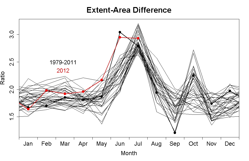
We can look at the annual cycle in detail by plotting each year’s difference or ratio on top of the other years. Here’s the difference, by month, up through 2006 (the y-axis is mislabelled “Ratio” but the title is correctly “Difference”):
...
This serves to define the “normal” annual pattern in extent-area difference. It increases in June, is greatest in July, sometimes dips below average in September, and often shows a secondary rise during October. But during the record-smashing year 2007 a unique pattern element emerged:
...
The following years, 2008 through 2011, returned to the previous pattern. Here’s the data, I’ve left the dots on 2007 and added 2008 through 2011, which are kinda hard to pick out since they don’t really deviate from what happened before:
...
But this year again shows essentially the same oddity observed in 2007, namely, an exceptionally high value during June:
 http://tamino.wordpress.com/2012/08/05/harbinger/
And the exceptional nature of 2007 and 2012 is evident in the ratio graphs too (he has animated versions if you like them). It looks like the Arctic ice is breaking up unusually early, and this indicates a record year.