Welcome to DU!
The truly grassroots left-of-center political community where regular people, not algorithms, drive the discussions and set the standards.
Join the community:
Create a free account
Support DU (and get rid of ads!):
Become a Star Member
Latest Breaking News
General Discussion
The DU Lounge
All Forums
Issue Forums
Culture Forums
Alliance Forums
Region Forums
Support Forums
Help & Search
Environment & Energy
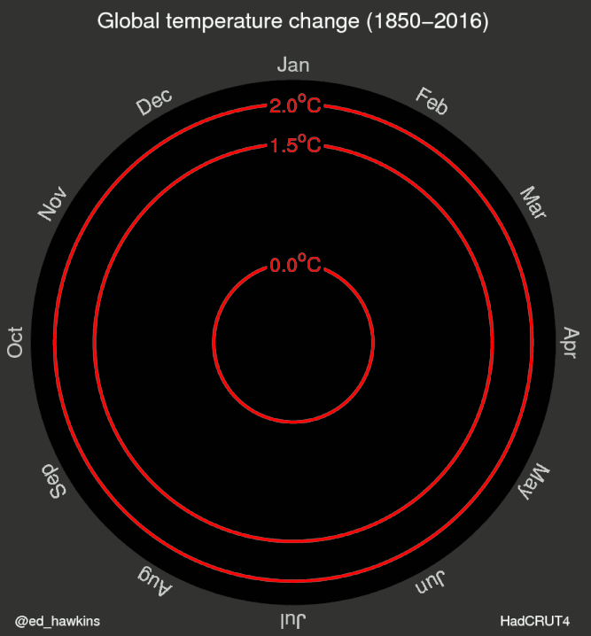
Related: About this forumData visualization - 166 years of global warming
As you watch the spiral unwind, keep in mind that the baseline being used is 1950-1980. To get the divergence from the 1880 temperature used as a pre-industrial reference by the IPCC, you need to add 0.3ºC to the shown temperature. This matters because February and March of this El Nino heated year were already above the 1.5ºC "desired safe limit".
InfoView thread info, including edit history
TrashPut this thread in your Trash Can (My DU » Trash Can)
BookmarkAdd this thread to your Bookmarks (My DU » Bookmarks)
6 replies, 779 views
ShareGet links to this post and/or share on social media
AlertAlert this post for a rule violation
PowersThere are no powers you can use on this post
EditCannot edit other people's posts
ReplyReply to this post
EditCannot edit other people's posts
Rec (13)
ReplyReply to this post
6 replies
 = new reply since forum marked as read
Highlight:
NoneDon't highlight anything
5 newestHighlight 5 most recent replies
= new reply since forum marked as read
Highlight:
NoneDon't highlight anything
5 newestHighlight 5 most recent replies
= new reply since forum marked as read
Highlight:
NoneDon't highlight anything
5 newestHighlight 5 most recent replies
Data visualization - 166 years of global warming (Original Post)
GliderGuider
May 2016
OP

Dustlawyer
(10,497 posts)1. K&R for exposure!

Hydra
(14,459 posts)2. Can we say, "spiraling out of control"? n/t
tk2kewl
(18,133 posts)3. death spiral

The2ndWheel
(7,947 posts)4. Looks like the growth pattern of cities
GliderGuider
(21,088 posts)5. Systems with non-linear growth tend to map into spirals like that. nt

pscot
(21,024 posts)6. That's pretty slick
