Photography
Related: About this forumPost-processing thread
I hope I can talk some of you all into posting a favorite post processing technique--before and after. I have Irfanview, Picasa, and Photo Director. I barely use Irfanview except for resizing. I have only recently started using Picasa. I had tried it before and not liked it. But I have discovered some pretty cool techniques. Oh, I actually have Lightroom too but I already like Photo Director and haven't wanted to learn it.
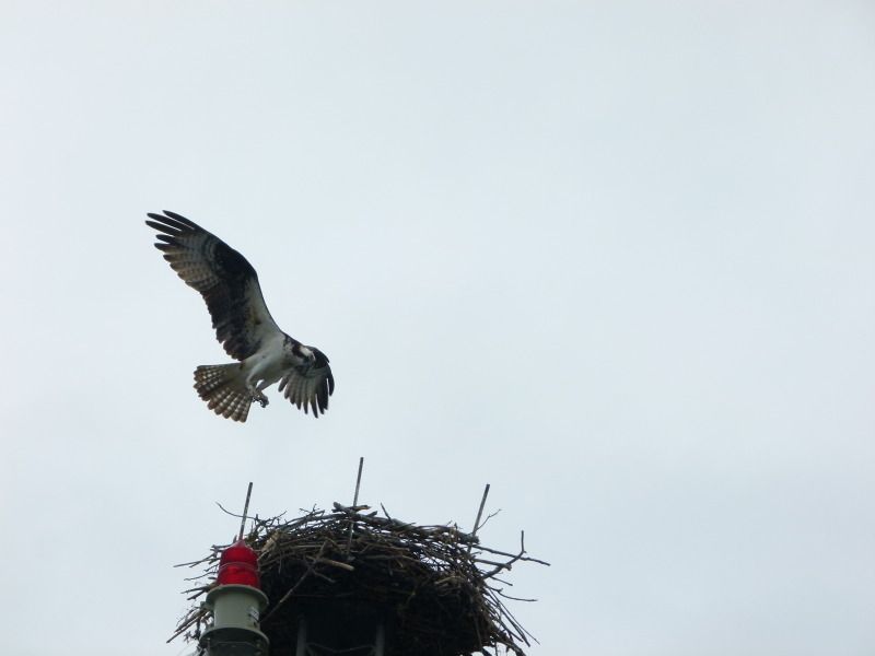
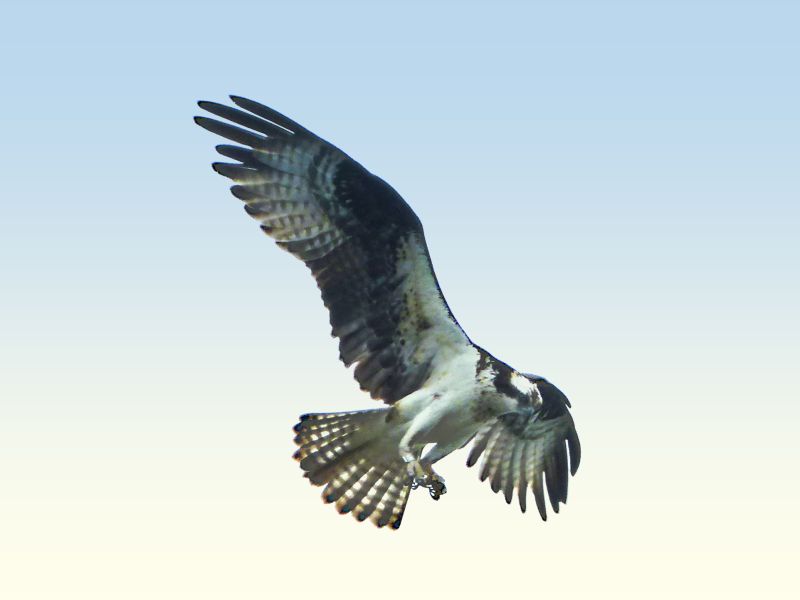
Even though I screw around with post processing quite a bit, I realize I am a novice. One reason I even tried Picasa again was because someone posted here about the new version being good. So, I discovered something in Picasa I really like and I didn't know was there. It is called graduated tint. I took a photo of an osprey and I had to lighten it. An already blah sky disappeared, so I added "graduated tint" in Picasa, which makes it more interesting. I understand in Photoshop now you can actually add cumulous clouds. I'm not interested in that kind of foolery at the present time, but that sounds interesting!
Anyway, I am not pretending this is the best flying osprey photo around, but it happens to be mine. Obviously I cropped it too. I added a bit of warmth to it, and that is why the bottom of it is more cream colored than white. I should have entered a thin frame around it too, probably.
My hope was that other people in this thread would illustrate a favorite post processing technique that others might not know about. It could be something extreme or subtle, I don't care. Even if it seems obvious, people here might not know about it.
 = new reply since forum marked as read
Highlight:
NoneDon't highlight anything
5 newestHighlight 5 most recent replies
= new reply since forum marked as read
Highlight:
NoneDon't highlight anything
5 newestHighlight 5 most recent replies

Major Nikon
(36,827 posts)I've been using Photoshop for years. I never really got all that good with it, but I can do all sorts of menial tasks like red eye fixing, teeth whitening, masking blemishes, color correction, etc. I use Silver Efex and Color Efex plugins quite a bit to do most of my heavy lifting. Color Efex has a pretty good set of tools for graduated filters, neutral density, etc.
Here's a pic I added a bit of grad filter to darken the sky a bit.


bluedigger
(17,086 posts)I like the idea of this thread very much. Thanks, Celebration!  Could I suggest a before and after photo to illustrate the effect?
Major Nikon
(36,827 posts)The original image actually has much more detail, as the resizing loses quite a bit.


Celebration
(15,812 posts)I don't see what it lost (??) I love the subtle graduated tint. You can barely notice it. I did put this response under the wrong photo.

trusty elf
(7,394 posts)

Blue_In_AK
(46,436 posts)I use PaintShop X, and I just play around with it until the photo looks the way I want. I often run them through the "histogram stretch" under "Brightness and contrast," sometimes I use the backlighting or fill flash functions, I sharpen, maybe mess with the highlight/midtone/shadow. "Fade correction" under "Color" if it's necessary (I really like this one for shots out of airplane windows because it eliminates all the haze). I usually hit them with the "edge preserving smooth" thing under "noise reduction."
I also have Paint Shop Photo Pro X3 loaded on my computer, but it tends to cut out sometimes, so usually I just use it after I've finished everything in the other program. There's a "vibrancy" button that makes the photo pop which I really like for flowers and things with good color.
I really don't know much about this. I just use what I need.
Celebration
(15,812 posts)just fool around with buttons until it looks okay.
I wondered what vibrancy was for! It doesn't look good with birds, mostly.

Mira
(22,380 posts)Good one! I know nothing, and have all of it to learn. I signed on to a 3 hour photo course, but have not taken it yet. 
I only use Picasa, have of course said this before.
I have photoshop, I use it only for my work, not for editing photos, at this point. I bought Lightroom 3 (when someone here pointed to the sale of 70 bucks for one more day  but have not installed it.
I use Picasa til the photo looks the way I want it to. Most of the time I do stuff and then undo, and at the end I'm awfully close to how it looked when I first took it, with maybe a bit of enhancement with the simple buttons. At times I have used the selected black and white, sparing out a little color. Once even won a contest leaving a cardinal bird red, and converting the whole photo to b/w.
My most critical aid in all photo processing is the crop. Without the crop, I'm nothing. Even though, when I was a little girl, my Dad (a pretty celebrated and published b/w amateur photographer) let me look into his Leica as he taught me how to properly frame out photos.
Celebration
(15,812 posts)Oh, and the slight rotate!
Have a great time at the course........

alfredo
(60,074 posts)I remember being told that you take a snapshot with a camera, but you make a photograph in the darkroom.
Cropping is essential in stret photography. You are working fast and you may not have time to frame the image properly

Stevenmarc
(4,483 posts)I really don't have a favorite because the process should never drive the image, the image drives the process.
I love B&W but not every image is made more visually interesting by using it, it's not a wand that magically makes an image into a Bresson. I like HDR especially when it's not obvious that it's been used. I've been known to manufacture a bit of DOF when I've had a distracting background.
Personally 85% of my workflow can be accomplished in Lightroom and when I need to use layers and masking I finish it in Photoshop, Nik and OnOne are good friends.
Celebration
(15,812 posts)but surely you find yourself using some techniques more than others, or maybe you discovered a new one lately that you are happy you found?
As an example, I can't imagine using a graduated tint unless I had a sky. So definitely the photo drives the choices.
I think I could probably use black and white more than I do. I keep telling myself that. I tend to just unsaturate it, but not all the way.
Everything is so green and lush around here sometimes it is just TOO green, and overtakes the photo. In that case I cut back on the green so it doesn't quite as shocking. But I don't do that with, um, industrial photos.  I would still call it one of my favorite techniques, though I doubt if I would use it much if I lived in the desert.
Stevenmarc
(4,483 posts)I consider Lightroom and Photoshop a big bag of tools and the concept of favorite is like asking a carpenter what he likes better, the hammer or the screwdriver, the job drives the tool.
I do a lot of B&W, a throwback to a ton of film I've shot and a lot of basic concepts that I used in the darkroom do carry over into my workflow like dodging an burning, which can be done easily in Lightroom with the brush tool. If there is one technique that I do use frequently it's one that I use in camera, if you ever wondered why anyone would use the Raw+Jpeg setting their camera and why does one need to save the shot in two formats, well it's very helpful in B&W shooting. Most cameras that have a Raw+Jpeg alow you to set your Jpeg to B&W so when you chimp your shots they're in B&W, its a good way to have a basic preview of what you shot, afterwards I toss the Jpegs and process the Raw.

Solly Mack
(90,767 posts)
Straightened. Cropped. Kept the fly. Light adjustments and color saturation. HDR.

Celebration
(15,812 posts)I need to learn HDR.
Solly Mack
(90,767 posts)alfredo
(60,074 posts)Of course I like black and white with or without HDR.
alfredo
(60,074 posts)Black and White conversion with different color filters.
Levels, Curves, Auto White Balance, and the fade plugin to undo what the WB did.
GIMP is free and open source.
Celebration
(15,812 posts)GIMP has a reputation for being both excellent and not intuitive.
I get the last part because I gave up on it! I think I read that it can do almost everything Photoshop does. Since I am not familiar with either Photoshop or GIMP I am not standing by that statement. I think I just read it somewhere.
Curves again! What is curves?
alfredo
(60,074 posts)Remember the S curve.
I started using GIMP when it was Ver. 1.2 on LinuxPPC. It's now at 2.8 and is very powerful.
If you remember this, you know your PPC Linux distros.


Richard D
(8,754 posts)Of course, cropping is essential.
Other things I do is to fiddle with contrast, color balance, saturation, exposure, brightness, sharpness, vignette, and some things to remove chromatic aberrations.
I also will stitch together multi-shot panoramas, and do HDRs.
Sometimes I use add-ons that are fun too to get more interesting effects.
Rarely I use photoshop, mainly to take things like wires and lens flare out.
Celebration
(15,812 posts)I try to feather it a lot though.
I just assume almost everyone here does cropping, and straightening when needed.
Celebration
(15,812 posts)since I really don't want to buy it.
I take lens flare out with spot removal. I can do that to a certain extent with wires, but I am sure Photoshop is easier and better for those things.
alfredo
(60,074 posts)I'm glad I did.
I had the PPC version. PS7.

ljm2002
(10,751 posts)...starting with rotation, if necessary, then cropping, then adjusting levels and/or curves OR going to HDR toning. I use HDR toning if I want to get more details visible -- i.e. in architecture shots, or sometimes it can help you get back some cloud detail that gets washed out.
When using levels, I may try Auto first. Sometimes it gets it just right. Most of the time, though, it doesn't. What I usually do with Levels is pull in the outer sliders a bit, which gives it a bit more contrast. When using curves, I pull up the curves dialog, then use the eyedropper to select which part of the image I want to adjust and note where it falls on the curve. Then I pull that part of the curve up or down, and usually do the opposite on the other half of the curve -- again, getting more contrast and sometimes recovering details.
Then I adjust colors and saturate or desaturate. Sometimes I fiddle with particular colors -- Photoshop's Hue/Saturation lets you choose which color to saturate/desaturate. Lately I have had a lot of outdoor shots where there is too much cyan so I tone it down; also, I find that darkening the blue can make the sky look better and avoids having to do selections or other complicated stuff.
I like to keep it looking more or less natural, although I'm not above pumping up the saturation a bit to give it a little more pop. I very rarely use black and white, even though I love good black and white photos that other people do.
Celebration
(15,812 posts)Some is Photoshop specific, maybe, like curves, sliders, etc.? Sounds like baseball pitches.
Mostly I just fiddle around with a photo until I get it to look as right as possible. On landscapes I end up using contrast more than I do with birds. The markings on birds don't stand out as much when you add much contrast.
I don't do much black and white either, but, like you, love it when others use it. I do use it a little bit.
trusty elf
(7,394 posts)with some understated post-processing. 

[IMG] [/IMG]
[IMG] [/IMG]
Mira
(22,380 posts)who will forever be the photo shop king to me - I had to have me a little load of Lightnin".
My kitchen is still full of the Blues........
(you are an inspiration to me about what "photo shopping" can really mean, what tickles me above all is that you even turned on the lights.)
trusty elf
(7,394 posts)Actually hadn't seen any clips of him when he was that age.
Here's a wonderful vid from earlier days.
alfredo
(60,074 posts)I really like his music.
Celebration
(15,812 posts) trusty elf
(7,394 posts)glad you like it, thanks Celebration!
alfredo
(60,074 posts)Richard D
(8,754 posts). . . to your skill.
alfredo
(60,074 posts)darken the image. That's about all I did.
Oops! forgot to add the link.


Ms. Toad
(34,073 posts)[url=http://www.flickr.com/photos/78401938@N02/7188745285/][img] [/img][/url]
[url=http://www.flickr.com/photos/78401938@N02/7188754807/][img] [/img][/url]
[url=http://www.flickr.com/photos/78401938@N02/7373980276/][img] [/img][/url]
[url=http://www.flickr.com/photos/78401938@N02/7373982240/][img] [/img][/url]
The basic technique is to convert the image to black and white, make a duplicate as a new layer, convert the top layer to a negative image, use the Dodge blend mode for the top layer (this will make the image appear nearly completely white), Gaussian blur the top layer (the amount of blur varies considerably - you just have to play with it), adjust the opacity of the top layer to let some of the lower layer show (generally no more than 25%). If desired, use the charcoal art media effect to provide the finishing touches (I used it on both of these).
I have used this technique with color, as well, but couldn't get a quick example to look right.

MattSh
(3,714 posts)I often use HDR. On just about anything (except if the original has high noise. HDR seems to greatly amplify noise). And often not "true" HDR, meaning I start with one original, create a -2 & +2 version (or whatever feels right). Create the HDR.
Then I bring the three originals plus the HDR version into Photoshop. If there's something I like better on the original, I blend it back into the HDR, anywhere from 20% to 100% opacity, depending on the photo. Generally add sharpness and detail with Topaz Detail.
In this case, I also added a graduated blue filter to the sky.
An example...

Celebration
(15,812 posts)Since I don't have Photoshop, I generally try to add "gradient mask" in Photo Director to try to accomplish the same thing. I can see where your version might work a bit more easily with some photos.