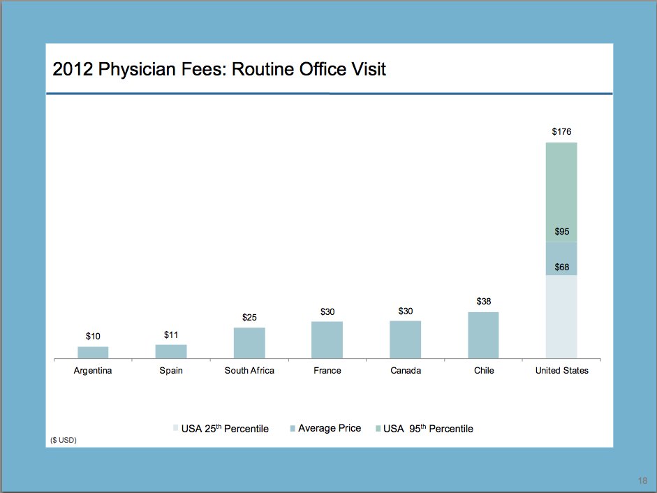
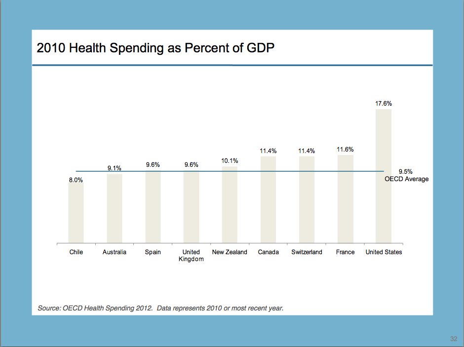
Six Charts That Illustrate Just How Much Higher Health Care Costs Are For Americans
Decades of data have shown time and again that the U.S. has the costliest health care system in the world by a variety of measures.
Still, a report released by the International Federation of Health Plans (i.e., health insurance companies) today provides a striking reminder of just how much more expensive health care is for Americans.
The report compared prices in the U.S. with prices in 11 other nations. It found that average prices in the United States are higher for most medical services cited in the report, but at the top end of the range, U.S. health care prices can be staggering compared to what citizens of other nations pay.
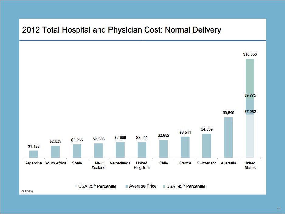
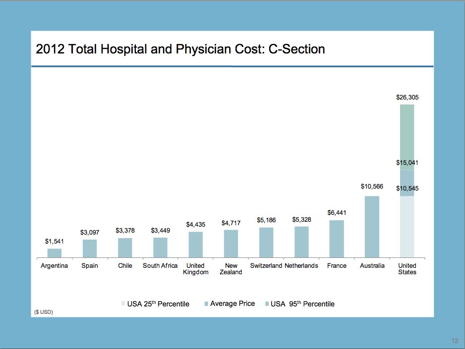
Planning to have a baby? At an average price for a normal delivery of $9,775, you'll pay more than a woman in the 10 other countries in the report -- and possibly as much as $16,653, or double what it would cost an Australian woman and more than 14 times the price for a woman in Argentina. The average price of a Cesarean section in the U.S., $15,041, is also higher than any other country -- and it could cost as much as $26,305.
http://www.huffingtonpost.com/2013/03/26/charts-health-care-costs-americans_n_2957266.html
 = new reply since forum marked as read
