General Discussion
Related: Editorials & Other Articles, Issue Forums, Alliance Forums, Region ForumsNothing says futurism, like a 21st Century 'Space Force'. . .
.
that uses Roman Numerals for its founding year.
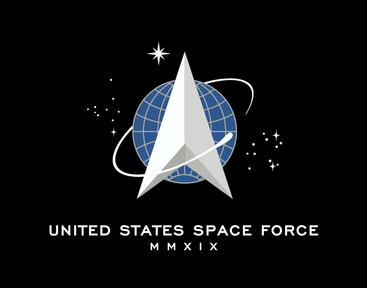
.
 = new reply since forum marked as read
Highlight:
NoneDon't highlight anything
5 newestHighlight 5 most recent replies
= new reply since forum marked as read
Highlight:
NoneDon't highlight anything
5 newestHighlight 5 most recent replies

Newest Reality
(12,712 posts)That that logo looks like something a RWinger would create. Did they tap Michel Malkin or some other pundit to do create it? I don't just mean the symbols, but the visual style.
No, really. I have seen much more professional logos in science fiction, though I see a possible attempt to mimic them, (see below). This is something out of a coloring book for idiots. The Right has no sense of aesthetics, creativity, color, form, etc. The minimalism smacks of some old regimes, as well.
It's like we are going forward into the past as a retrofuture. There is nothing inspiring about that kindergarten-style farce. Are they sure it's not Space Farce?


TheBlackAdder
(28,211 posts)muriel_volestrangler
(101,355 posts)
underpants
(182,868 posts)I hadn’t noticed the money shot on any of the logos before.

jls4561
(1,260 posts)After all, the Super Bowl uses them.
TheBlackAdder
(28,211 posts)
or am i serious?

Fozzledick
(3,860 posts)Newest Reality
(12,712 posts)It occurred to me that all the wing-ding Qcumbers are going to be all over the symbolism, especially the stars and their number, etc.
The paranoid pareidolia is strong with them. It should be a real hoot.

meadowlander
(4,402 posts)
Newest Reality
(12,712 posts)Well, it is as if he has pulled down his XXXXX-L Depends and is MOONING us. I didn't think he could be that subtle about it though.
Try new, TRUMP MOON CHEESE! It's the greenest in history. People are saying that!
LastLiberal in PalmSprings
(12,591 posts)It looks like a Star Destroyer (the ship we see at the beginning of the first "Star Wars" movie) encircled by a sperm chasing its own tail. It's like they flipped the NASA logo and replaced the red swash with a space battleship.
