General Discussion
Related: Editorials & Other Articles, Issue Forums, Alliance Forums, Region ForumsSomeone appears to have left papers of the KLOBUCHAR 2020 campaign logo in a coffee shop...
Link to tweet

Does Minnesota have mountains?
 = new reply since forum marked as read
Highlight:
NoneDon't highlight anything
5 newestHighlight 5 most recent replies
= new reply since forum marked as read
Highlight:
NoneDon't highlight anything
5 newestHighlight 5 most recent replies

mahatmakanejeeves
(57,613 posts)
hlthe2b
(102,376 posts)Just my FIRST impression, mind you (and after that, gratitude that it wasn't Warren's first attempt at a logo) 

Yo_Mama_Been_Loggin
(108,212 posts)hlthe2b
(102,376 posts)
jcgoldie
(11,646 posts)... they represent agriculture... just ask Ben Carson. 
TheBlackAdder
(28,216 posts).

.

enid602
(8,654 posts)She’s an Egyptian spy. Russiian spies are so 2016.
Tipperary
(6,930 posts)Odd logo.

calimary
(81,500 posts)That was my first impression. A beautifully decorated teepee with the local symbology of mountains and landscape. I really like that design. Would be a nice tip-of-the-hat to local tribal heritage of the Upper Midwest.
Stare Decisis
(229 posts)Good to know Pistons guy found a job.
 ?w=1000
What kind of a horse exactly is a Piston?
The Velveteen Ocelot
(115,858 posts)There's a range of hills along Lake Superior called the Sawtooth Mountains, which are left over from a series of volcanic eruptions about a billion years ago, but they've eroded rather considerably. The design is OK but they might get some grief about the lack of actual mountains in Minnesota.
hlthe2b
(102,376 posts)
k8conant
(3,030 posts)"Whether a landform is called a mountain may depend on local usage. Mount Scott outside Lawton, Oklahoma is only 251 m (823 ft) from its base to its highest point. Whittow's Dictionary of Physical Geography[2] states "Some authorities regard eminences above 600 metres (2,000 ft) as mountains, those below being referred to as hills."
https://en.wikipedia.org/wiki/Mountain
The Velveteen Ocelot
(115,858 posts)KCDebbie
(664 posts)There's nothing about the logo that pushes any buttons or that I dislike...

jmowreader
(50,562 posts)When you shrink it down to an inch high for letterhead, or 5/8" high for envelopes and web sites, it's going to turn into an unrecognizable blob.
hlthe2b
(102,376 posts)jmowreader
(50,562 posts)Have her write "Amy" in cursive. Scan it in, outline it and color it Democratic blue. Then put the number 2020 under the last two letters in the name, colored the same red we use in our donkey logo. The font for the 2020 will be Franklin Gothic Heavy.

madaboutharry
(40,220 posts)It looks like a logo for a Swiss candy. That’s what it makes me think of.

panader0
(25,816 posts)
Dem_4_Life
(1,765 posts)Not really a fan personally.
And a big oops for whoever left it behind.

WhiskeyGrinder
(22,438 posts)cwydro
(51,308 posts)Marcuse
(7,508 posts)Wellstone ruled
(34,661 posts)on the Range and is used as a Ski Hill. Other than that,no,unless you consider the Slag Piles from the Ore Pits as Hills. The next tallest hill is Buck Hill in Bloomington.
LakeSuperiorView
(1,533 posts)In the middle of the Superior National Forest, it is not a ski hill. Are you thinking Giants Ridge? Eagle Mountain is 328 feet taller, with it's peak at 2301 feet above sea level. Giant's Ridge is 1972 feet above sea level.
That's based on highest point of course, Giant's Ridge may have a greater change in elevation from peak to surrounding land, but I think Lutsen has more elevation change than Giant's Ridge. I do not know what feature in Minnesota has the largest local elevation change, so I usually go with Eagle Mountain on the basis of the highest point in Minnesota. It's also only about 15 miles from the lowest point in Minnesota, the surface of Lake Superior at about 602 feet above sea level. Mines don't count there - Tower Soudan Mine's lowest level is below sea level.
Wellstone ruled
(34,661 posts)Isn't Lutsen the Lake Bluff. Been forty years the last time we Skied Lut.
LakeSuperiorView
(1,533 posts)But what hill were you thinking of on the Range?
Wellstone ruled
(34,661 posts)Do remember the Slag pies by Hibbing being called hills. Always kidded my Cousin about those overburden Piles he used to play on.
TheBlackAdder
(28,216 posts).

.
greatauntoftriplets
(175,750 posts)PLEASE!
JDC
(10,133 posts)It also looks like Citgo's sign in Kenmore Square near Fenway.
Maybe this is just a cheap and "trendy" way to focus group it via social media. "It was mistakenly left" happens a lot it seems.
ProudLib72
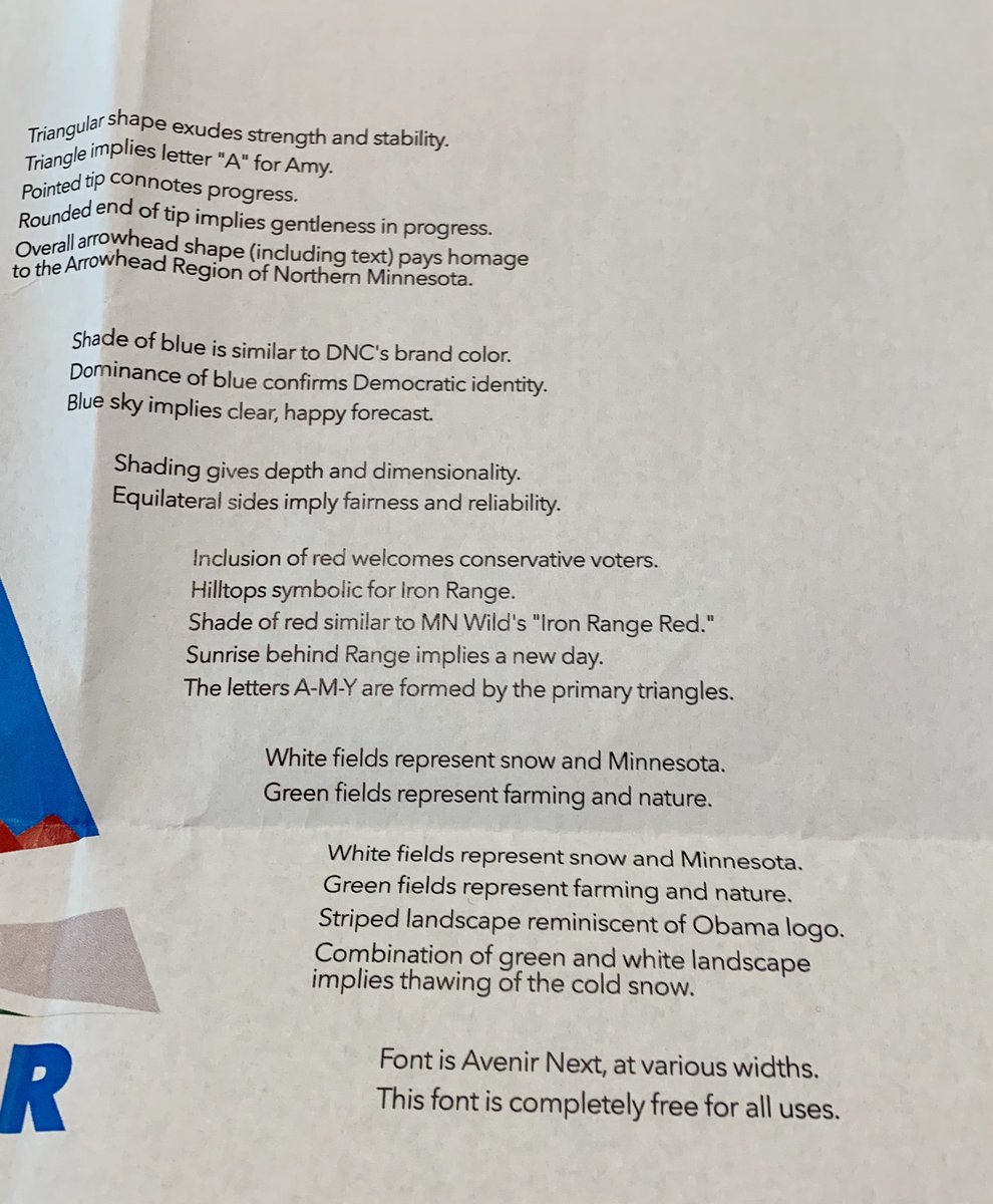
(17,984 posts)"Shape exudes strength and stability"
"Pointed tip connotes progress"
"Rounded end of tip implies gentleness in progress"
Comes in an assortment of colors.

Lefta Dissenter
(6,622 posts)Otherwise, I’m not loving it.