General Discussion
Related: Editorials & Other Articles, Issue Forums, Alliance Forums, Region ForumsOne Simple Chart Shows Why An Energy Revolution Is Coming - And Who Is Likely To Come Out On Top
The cost of producing solar power is rapidly declining: it now costs $50 to produce one megawatt-hour of solar power, according to a new analysis.
Coal, on the other hand, costs $102 per megawatt-hour to produce.
This recent change could be a sign that the world is on the verge of an energy revolution.
The cost of solar power is decreasing so rapidly, it's now cheaper than coal, based on a new analysis.
A recent report from Lazard shows how the costs of producing electricity from various sources are changing. Energy from utility-scale solar plants — plants that produce electricity that feeds into the grid — has seen the biggest price drop: an 86% decrease since 2009.
The cost of producing one megawatt-hour of electricity — a standard way to measure electricity production — is now around $50 for solar power, according to Lazard's math. The cost of producing one megawatt-hour of electricity from coal, by comparison, is $102 — more than double the cost of solar.
http://www.iflscience.com/environment/one-simple-chart-shows-why-an-energy-revolution-is-coming-and-who-is-likely-to-come-out-on-top/
 = new reply since forum marked as read
Highlight:
NoneDon't highlight anything
5 newestHighlight 5 most recent replies
= new reply since forum marked as read
Highlight:
NoneDon't highlight anything
5 newestHighlight 5 most recent replies
SWBTATTReg
(22,133 posts)RUMP and cronies to stop their persistent support of the oil/fossil fuels industry and start giving a hand implementing solar and wind more aggressively into homes and businesses more than it has...

Quixote1818
(28,946 posts)I think the same thing will happen with Oil and Gas in the next decade. It will start stronger in Europe but the US will have to follow quickly or be left in the dust. I thought Kodak had too much power to allow digital to take hold because if you can buy one 32 gig card for $30 there is almost no money in that part of photography anymore when it was a powerhouse business before but it didn't stop the industry from realizing it had to go that direction or get left behind. Well, everyone except Kodak. As solar and wind become less expensive the market will change automatically due to demand and there is not much Oil, Gas and Oil will be able to do to stop it at that point.

blugbox
(951 posts)That not only was Kodak not able to keep up in the photography industry... But since we are also mentioning the decline in nuclear energy... Kodak also had a NUCLEAR REACTOR in their HQ basement with 3.5lbs of uranium until 2006 hahaha...
This has nothing to do with current news, but I remembered Kodak and Nuclear Energy ties...
duforsure
(11,885 posts)Its devaluing Russian Putin's oil profits fast. I am not driving anywhere I can keep from it against what they're doing and against Putin and rump corruption. Have reduced more than 40% already.

stopwastingmymoney
(2,042 posts)Economics always wins out in the end
Solar is also going to become much cheaper for the rest of us. I'm waiting for that, keeping my current car as long as my large old dog is living, then I'm going electric. We have a new roof now, solar panels in our future...
diane in sf
(3,914 posts)To getting a 200 mile range electric car and solar panels. F Putin, Exxon, the Koch roach bros, and all the carbon and radiation pushers. I hope their fall is rapid and complete and they lose their ability to buy our government and bend it to their whims. Once we’re off oil, it will remove a lot of the incentive to keep wars going in the Middle East, etc.
An additional note on energy conservation. I replaced my 50 gallon tank gas-fired water heater with an on-demand wall system. My gas bills are now $8.50-13.50 a month except during the three winter months when they go up as high as $60-70.
Also, I love trains.

procon
(15,805 posts)The solar and wind energy companies are the future.

SunSeeker
(51,571 posts)
sarchasm
(1,012 posts)Does the cost of solar or wind include storage costs, or is it just production?

NBachers
(17,120 posts)
Eko
(7,318 posts)driving their nuclear car.

madinmaryland
(64,933 posts)
Eko
(7,318 posts)Eko
(7,318 posts)also. BTW, great post!
RandomAccess
(5,210 posts)Just think how far along we'd be if we'd pursued these alternative energy sources when we first could have.
NBachers
(17,120 posts)
VOX
(22,976 posts)Of major importance.

NeoGreen
(4,031 posts)
NNadir
(33,525 posts)The "shill" accusation applied to anyone who can think clearly is about as old as predictions that solar energy would save the day.
We are more than half a century into solar will save the day chants.
Therefore its wonderful to learn yet again from the set of people obliviously repeating this chant while impinging the integrity of scientists that 50 years of such chanting has prevented the concentration of CO2 from reaching 410 ppm.
In fact the continuously hyped, useless an toxic solar industry did nothing, absolutely nothing to prevent the growth, by 60 exajoules per year, of coal use on this planet in the 21st century. Of course people celebrating the purported death of coal have not the faintest idea about serious data collection from the international energy agency, anymore than they have interest in the work of serious scientists.
A reasonable person could easily accuse the ignorant people responsible for this tragedy of being gas shills, but I'm inclined to regard them as delusional faith based science illiterates who don't give a rat's ass about future generations. Even though their morally withered view is that no one can do anything at all on an ethical basis and that everything is about money, I personally doubt that the semiconductor industry pays them off. They're clearly willing to be stupid and oblivious for free.
The average increase in CO2 in this century per year has reached 2.2 ppm per year, up from considerably less than 2.0 in the 20th.
This is surprising given that I've been listening to solar victory dances my whole damned adult life, and I'm not young.
I have no idea what these berserk dancers are, but they're not environmentalists. Given their indifference to the people who mine the stuff for their useless bourgeois fantasies, I certainly wouldn't regard them as humanists either.
61 years of such chanting for nuclear has not prevented the concentration of CO2 from reaching 410 ppm either, now has it?
cannabis_flower
(3,764 posts)wind power costs have gone down too and is even cheaper than solar.
packman
(16,296 posts)Smart batteries-cheap batteries for home usage will be the coup de grâce for fossil fuels

modrepub
(3,496 posts)PJM being the grid manager for most of the east and midwest regions. As best I can figure, the break even point for a coal plant is between $40-43 per MW, gas plants are around $30 per MW. The actual price on the grid fluctuates due to load conditions. If electric prices stay low on the grid for an extended period of time then coal plants loose money and eventually shut down permanently. According to EPA's CAMD website, the number of units in the US that list coal as their primary fuel source has declined 30% between 2015 and 2017.
I suspect the prices used in this report are based on the total costs of a new plant averaged out for the lifetime of the plant. In round figures it costs about one billion dollars to build a large combined cycle gas plant. A comparable land-based wind farm is around four to six billion dollars. A similar sized coal plant six to eight billion dollars and nuclear fifteen to twenty-five billion dollars. Given these costs, why would any finance company or bank buy into a plant that will receive the same price for a megawatt of electircity as a combined cycle gas plant? Unless it's government backed or financed, I don't see very many coal or nuclear plants being constructed in the future. At some point all the existing coal and nuclear plants will either age out or close because they are no longer economical to operate.

BlueJac
(7,838 posts)Coal and gas are soon to be has been, and the risks of nuclear are high. We will get this solved without the Republicans help in Congress
Demovictory9
(32,457 posts)
hunter
(38,317 posts)When you think of it that way the chart doesn't look so nice.
Hybrid wind-solar-gas systems are not going to "save the world."
Imagine you are selling fracked gas. If wind and solar locked in gas sales of 2/3 of the electric market for as long as the wind turbines and solar panels last, would you take the deal?
Fracked gas is every bit as horrible as coal but the damage to the environment isn't as obvious as strip mining or dead coal miners.
At this point in the argument somebody always says "batteries," maybe with links to projects in South Australia or Southern California, but the capacity of those systems is measured in minutes and the purpose of them is to allow older less responsive fossil fuel power plants time to pick up the load when wind or solar power drops out. They don't store anywhere enough energy to keep the lights on for days or weeks the sun isn't shining or the wind isn't blowing.
If we were seeking to raise the reliability of wind and solar power by building large storage systems (huge off-channel pumped storage projects, flow batteries, etc...) the cost of solar and wind energy escalates rapidly.
progree
(10,909 posts)------------------------------
Just throwing this out here -- despite the optimistic first part of the article, it still seems economical utility-scale storage is still quite aways away.

grantcart
(53,061 posts)hunter
(38,317 posts)Adding even a few hours storage to "free" wind and solar power pushes the the cost per megawatt hour up through the roof.
The current Tesla "Power Wall" stores 13.5 kwhr and costs $5900. Optimistically that's enough to run a small window air conditioner (and nothing else in your home) for about 24 hours.
The basic problem doesn't go away with scale, it's the same for a private home or a regional electric grid. The sun doesn't always shine and the wind doesn't always blow. People off-the-grid tend to buy dirty fossil fuel generators as "backup" to their dream solar and wind systems and end up making a much bigger environmental mess than they would have if they just moved to the city. Urban and high density suburban living can have a surprisingly small environmental footprint.
Germany's ambitious wind and solar program has brought the price of electricity to about 35 cents a kilowatt hour for home and small business users, but it's a sleight of hand because heavy industry is exempt and use coal generated electricity at less than 5 cents a kilowatt hour. The problem is simple, if German industry had to pay for wind and solar energy they couldn't compete in world markets.
In places amicable to pumped hydro storage the cost of storage is about $150-$200 a megawatt hour and the lifetime of the plant is indefinite, provided climate change doesn't dry up the supply of water.
Big Lithium battery plants are about $200 a megawatt hour, and Tesla is aiming for $100, but the lifetime of batteries is limited and this does not include recycling costs. Last I heard, Tesla is claiming their batteries will go 5000 cycles before they reach 80% of their original capacity.
Lead acid batteries cost less initially but I don't know anyone who has had to care for them who doesn't loathe them, not to mention the extreme toxic lead problems they've caused in less developed nations where battery recycling technology is primitive and poisons entire communities.
Batteries become very problematic if they have to be replaced every ten years and stations have to install excess capacity to account for battery degradation.
Here's the thing to remember: None of these costly storage schemes are necessary if you have responsive gas and hydro power systems.
Batteries can compensate for less responsive power systems, but in such cases battery capacities are measured in minutes.
There are some interesting numbers and analysis here:
https://www.lazard.com/media/438042/lazard-levelized-cost-of-storage-v20.pdf
progree
(10,909 posts)Last edited Mon Jan 4, 2021, 03:24 AM - Edit history (8)
ABBREVIATIONS:7dma - 7 day moving average
Quick Links
Worldometers: For country population sizes and the covid situation in each country and the world overall
https://www.worldometers.info/coronavirus/
Worldometers: For U.S. states (and the U.S. overall)
https://www.worldometers.info/coronavirus/country/us
New York Times: U.S. States: https://www.nytimes.com/interactive/2020/us/coronavirus-us-cases.html
. . . Countries of the World: https://www.nytimes.com/interactive/2020/world/coronavirus-maps.html
Covid Tracking Project: https://covidtracking.com/data
Positivity rates and testing rates and other metrics
https://coronavirus.jhu.edu/testing/tracker/overview
https://covidactnow.org/?s=1301312
https://coronavirus.jhu.edu/testing/individual-states
https://covidtracking.com/data
https://coronavirus.jhu.edu/testing/tracker/map/new-tests-per-100-k-people
RESTRICTIONS, Shutdowns, lockdowns -- see section way below
Alternatives to New York Times
## CovidActNow: https://covidactnow.org/?s=1124253 -- the states are numbered in the listing so don't have to count them like the NYTimes
## Global Epidemics: https://globalepidemics.org/key-metrics-for-covid-suppression/ -- also numbers the states
## Reuters: https://graphics.reuters.com/HEALTH-CORONAVIRUS/USA-TRENDS/dgkvlgkrkpb/index.html
## John Hopkins 50 states' minicharts "map" page, alternative to the NY Times from John Hopkins University
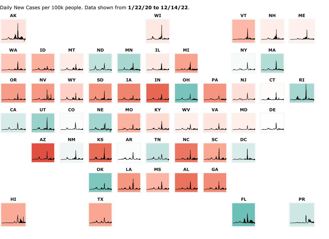
The below "map" of the 50 states' minicharts (which are scaled by daily new cases PER CAPITA), is from the John Hopkins U.https://coronavirus.jhu.edu/data/new-cases-50-states
Purpose: Just to gather together my favorite links in one place to check out a state or country.
Particularly for a U.S. state, I want more than just the number of cases (or hospitalizations or deaths), because I don't know if, for example, 10,000 new cases is a terrible number or not compared to other states. Yet people post such articles without giving any context. Often to bash an unpopular populous, but I want to know more.
The context I seek is, so I can compare it to my state, to other states and to the U.S. average :
Per Capita -- I'm sick and tired of people bashing populous states that people want to live in for having big case numbers. Tell me what its per-capita numbers are and how it compares in that regard to the U.S. average and to other states, e.g. is it 15th best or 12th worst or about median or what.
7 day moving average (7dma). I have literally absolutely no use whatsoever for one day data. Testing and reported case results vary greatly by day of the week and also just day-to-day statistical volatility. This day-of-the-week effect and volatility varies from state to state. And I don't want to see days reported that are a combination of 2 or more days presented as one day results.
7 day moving averages get rid of the day-of-the-week problem. Every 7dma is an average of all 7 weekdays.
As an example of the day-of-the week effect, here is an example from Minnesota, written [link: http://view.connect.mpr.org/?qs=d58e34dfb0d90fd5c90dcbd0c4c10b17040f093c075d5c1bfc498df1b9698dd9b346ed964dbc1c800bc68735dd5a17dac545f59e902fd40bd35583224933fe711274810f357ae8f6dc9a60c94792a31e|December 8 by David Montgomery]:
"Mondays are typically the days when the most people go get tested. And data from Mondays tends to show up on Thursdays and Fridays — since the beginning of September, on average about 10 percent of eventual cases are reported on Wednesday, 35 percent on Thursday, 23 percent on Friday, 13 percent on Saturday, and 16 percent on Sunday." ((Hmm, that totals 97%, meaning that only 3% are reported on Monday and Tuesday combined -Progree))
Daily new cases (as opposed to cumulative total since the pandemic began) -- I almost always want to know where the hotspots are NOW, not the states that had a rough spring or summer. (When I do want to look at cumulative totals since the beginning, I choose Worldometers for that (below) )
Trends - I want to know if new cases are increasing or decreasing, and how rapidly. I usually look at the mini-charts at the top of the New York Times page, and then click on a state for a detailed look and larger graphs, for example
U.S. with mini-charts for each state:
https://www.nytimes.com/interactive/2020/us/coronavirus-us-cases.html
California as an example: https://www.nytimes.com/interactive/2020/us/california-coronavirus-cases.html
In a posting, realizing that fewer than 10% of the people click a link, I often present a mini-summary, e.g. this from a January 3 posting of Nevada:Daily new cases, 7 day moving average
https://www.nytimes.com/interactive/2020/us/nevada-coronavirus-cases.html
1173 July 20 -- the pandemic high point until early November
277 Sept 13 -- post summer peak low point
2727 Dec 9 -- pandemic peak
1896 January 2 - latest (down 30% from the peak).
I have focused on cases, especially daily new cases per capita, 7dma in these links, because they are the leading indicator. Hospitalization rates and death rates tend to follow weeks after.
However, daily cases per capita in the data we see are reported cases. That in turn depends on the testing rate. Some states have relatively low testing rates and therefore, in general, relatively low reported case rates compared to those that do more testing. I have a special section below on testing rates and test positivity rates.
Hospitalization rates, especially new admissions rates if available, are the next metric in the timeline for me confirm that the situation is improving or worsening, and not just because of a change in testing rates. That and the trend in test positivity rates
DETAILS
Worldometers:
For country population sizes and the covid situation in each country and the world overall (with al the caveats below):
https://www.worldometers.info/coronavirus/
For U.S. states (and the U.S. overall)
https://www.worldometers.info/coronavirus/country/us
Vitally Important: the default "Now" button likely has incomplete and too small New Cases and New Deaths data. Better to click the "Yesterday" button or the "2 days ago" button to make sure to get complete case data for a day.
A sucky thing about Worldometers is that they don't have anything for new cases per 1M population or new deaths per 1M population. After clicking the "Yesterday" or "2 days ago" button as cautioned above, one has to do the math by dividing the New Cases (or New Deaths) by the population. And there's no way to sort the table by new cases per 1M population or new deaths per 1M population because these columns don't exist.
All of the per-capita stuff (Total cases/1M pop, Deaths/1M pop, Tests/1M pop) are cumulative totals since the pandemic began. To me, most of that is ancient history, and I usually care much more about what's been happening the last few days or weeks. But like I said above, New Cases and New Deaths are not given on a per capita basis).
Another caution about New Cases and New Deaths is (besides remembering to click the "Yesterday" or "2 days ago button" so as to get a full day rather than a partial day of information), is that the daily amounts fluctuate quite a lot from day to day with some high days being the result of unusual case backlogs being reported on one day, for example. I much prefer sites that present 7 day moving average so as to smooth out the day-to-day volatility, and to also capture an entire week so as not to get biased data for days of the week where there is usually low or high numbers such as weekends and Mondays etc.
Good things about Worldometers:
. . . Shows the populations
. . . Shows the U.S. overall on the listing of the U.S. states, and the world overall on the listing of countries. A lot of other resources don't do that simple common-sense thing, so that, for example to compare the infection rate of Illinois to the U.S. overall, one has to visit 2 pages, and sometimes can be hard to find.
===############################################===
New York Times
What's bad is that some people don't have access to the New York Times -- however do note that their coronavirus coverage is free and unlimited, but one has to sign up for that. And in the many months I've used it, I've never been asked to sign in again.
. . . U.S. States:
https://www.nytimes.com/interactive/2020/us/coronavirus-us-cases.html
I love it for its mini-charts of all 50 states (they are by default drawn to the same scale per capita so that states can be compared). As well as the table where one can rank the states by NEW per capita cases, 7 day moving average.
Warning that testing rates affect the reported case rates, so states that test more may have worse looking case rates than states that test less, and so comparisons aren't fair.
. . . Countries of the World:
https://www.nytimes.com/interactive/2020/world/coronavirus-maps.html
Same comments as for U.S. States.
===############################################===
Covid Tracking Project
CovidTracking: https://covidtracking.com/data
Good for U.S. overall statistics: Daily Tests, Daily Cases, Currently Hospitalized, Daily Deaths -- both for the most recent day, and the 7 day moving average. And Cumulative totals for all of the above (except hospitalization). All with graphs
Then followed by the above for each state. Some (most) have race & ethnicity statistics, long-term care facilities, viral (PCR) tests and antibody tests.
Unfortunately no graphs for the states.
But click on "Historical Data" links to see the daily numbers going all the way back.
===############################################===
Testing Rates (e.g. tests per day per capita), Positivity Rates
Yes, some states test more than others, and differ in positivity rates too. Thus ranking states by their reported cases (per capita or not) is unfair. Such a list like the above that lists states according to their daily new cases per capita is just a starting point. It is what it is. If there is a website that tries to adjust a list like the above for these factors, please let me know.
About testing rates - Early in the pandemic, there was a great shortage of testing facilities. In some places like Minnesota, they have become abundant, and so testing rates is as much or more a "demand side" issue as a "supply side" issue.
After soaring new cases and testing rates, our governor completely shut down bars and restaurants for indoor dining in mid-November. Within a few days, daily case levels dropped and then so did testing rates. Testing facilities keep getting added, but with fewer people getting infected, the testing rate also dropped. Most people don't get tested unless they feel some need to do so -- such as feeling symptoms or having been in close contact with a Covid-positive person.
(The declining number of cases in Minnesota was corroborated with rapidly dropping test positivity rates and soon afterwards by dropping hospitalization rates, and after 4 or so weeks, dropping death rates).
So I don't make an enormous hoo hah about a state's low testing rate (compared to other states or the U.S. average) if the test positivity rate is low as well. But a low testing rate combined with a high positivity rate is a big red flag. An even bigger red flag is if the foregoing is true, and additionally, new cases are going up.
Positivity rates and testing rates are compared here:
. . https://coronavirus.jhu.edu/testing/tracker/overview ::
If the page doesn't show all 3 columns ( New Cases, Tests per 100k people, and Percent Positive ), then try lowering your zoom level or widen the window.
Missing: U.S. overall test positivity rate and testing rate. Duh. Would be nice to have this, especially for comparing specific states to it.
. . https://covidactnow.org/?s=1301312 ::
This also has test positivity and also daily new cases per capita 7dma, so it's more useful for state ranking in daily new cases than NYTimes, since it has everything I want in such a listing except for testing rates. It also has Population, Infection Rate, ICU Capacity Used (%), and Tracers Hired (%)
In the second half of the page, there are graphs of Cases, Deaths, Hospitalizations, and ICU Hospitalizations all in 7 day moving average. And one can select per 100K and compare 2 or more states.
(BUT the [link: https://www.nytimes.com/interactive/2020/us/coronavirus-us-cases.html
|NY Times] has those mini-charts of each state's daily case trends all on one page)
Missing: U.S. overall test positivity rate and testing rate. Duh.
. . https://coronavirus.jhu.edu/testing/individual-states ::
U.S. Test Positivity Rate (just a graph) - If one chooses "US" in the pull down dark blue box near the top left, it shows a daily graph of the test positivity rate, 7 day moving average. (It also shows the number of daily tests in millions, and the number of daily positive tests in millions -- the latter is and hopefully remains a small fraction of a million). Unfortunately, for the test positivity rate, one must either read the graph, or hover your mouse over it -- in which case it will pop up the testing rate, as well as the number of tests and the number of positive tests.
Problem is positioning your mouse exactly on the day you want, usually the last day. For that, it comes down to manual dexterity coupled with zooming in (no reason they can't just show the last day's numbers to the right of the graph, sigh).
By the way, it is apparent from the graph that the daily tests fluctuate a lot from day to day. This is one reason I hate Worldometers and other sites that just present the most recent day or one day results. I very strongly prefer those that present the 7 day moving average as that eliminates the day-of-the-week effect, and more generally averages out the day-to-day volatility.
Note also that when the mouse is on the graph, a set of icons appears above the graph for things like zoom, pan, select, and many more. I find them very difficult to use. One that may be useful is "download as .png"
Lastly, note that one can show individual states by selecting them from the pull down dark blue box near the top left.
Missing: U.S. testing rate. But at least it has the U.S. positivity rate, though one has to read it from the graph or hover the mouse just right.
. . https://covidtracking.com/data ::
This has U.S. daily tests, daily cases, currently hospitalized, and daily deaths, all for the latest day and 7dma as well. And all as graphs. The U.S. overall daily tests, 7dma is above the first graph "7-Day Avg". See "The U.S. overall positivity rate and testing rate" section below for how to calculate the testing rate per thousand, per 100k, and per 1 million.
. . . . . Scroll down to see results for states (note the "Jump to a state" purple box with links to the right of Alabama, so you don't have to scroll and scroll)
. . https://coronavirus.jhu.edu/testing/tracker/map/new-tests-per-100-k-people ::
A color-coded map of Daily Testing rates per 100k people, 7dma (hover mouse over a state on the map to see the number for that state).
Missing: U.S. overall, duh
The U.S. overall positivity rate and testing rate :
. . U.S. overall test positivity rate, 7dma: Only one I've found is https://coronavirus.jhu.edu/testing/individual-states where one has to read it from the graph or hover the mouse just right.
. . U.S. overall testing rate:
This has U.S. daily tests, daily cases, currently hospitalized, and daily deaths, all for the latest day and 7dma as well. And all as graphs. The U.S. overall daily tests, 7dma is above the first graph "7-Day Avg".
As an example, the 7 day average on 1/2/21 was 1,535,081. Divide by the U.S. population of 332.0 million to get 1.535 M / 332.0 M = 0.0046 tests per person = 4.6 tests per thousand = 460 per 100k = 4,600 per million.
(source of U.S. population : https://www.worldometers.info/coronavirus/ )
===############################################===
RESTRICTIONS, Shutdowns, lockdowns:
New York Times, all states
. . . https://www.nytimes.com/interactive/2020/us/states-reopen-map-coronavirus.html
Midwest: Coronavirus-Related Restrictions By State, NPR, 12/3/20
. . . https://www.npr.org/2020/06/11/847413697/midwest-coronavirus-related-restrictions-by-state
NPR all states:
. . . https://www.npr.org/series/847328455/coronavirus-restrictions-in-each-state
===############################################===
Alternatives to New York Times
## CovidActNow: https://covidactnow.org/?s=1124253 -- the states are numbered in the listing so don't have to count them like the NYTimes
## Global Epidemics: https://globalepidemics.org/key-metrics-for-covid-suppression/ -- also numbers the states
## Reuters: https://graphics.reuters.com/HEALTH-CORONAVIRUS/USA-TRENDS/dgkvlgkrkpb/index.html
## John Hopkins 50 states' minicharts "map" page, alternative to the NY Times from John Hopkins University
The below "map" of the 50 states' minicharts (which are scaled by daily new cases PER CAPITA), is from the John Hopkins U.
https://coronavirus.jhu.edu/data/new-cases-50-states
-- at that page you can click on individual states on the "map". Showing 3-day moving average of new cases. I prefer the nytimes' charts which are 7 day moving averages). But I'm not sure how up to date the below .jpg image file is, so its better to click the ABOVE link (also the individual states on the above link are click-able to show more info on the states)

BSdetect
(8,998 posts)And the coal subsidies?