| Latest | Greatest | Lobby | Journals | Search | Options | Help | Login |
|
|
|
This topic is archived. |
| Home » Discuss » General Discussion |
|
| kpete
|
Mon Aug-29-11 11:45 AM Original message |
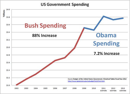
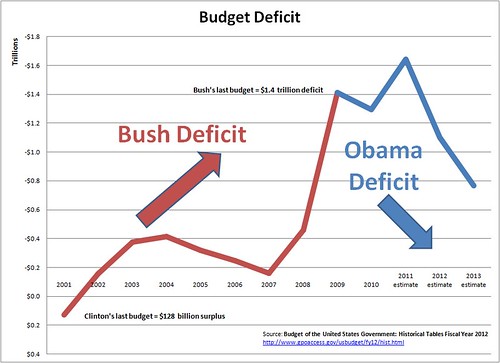
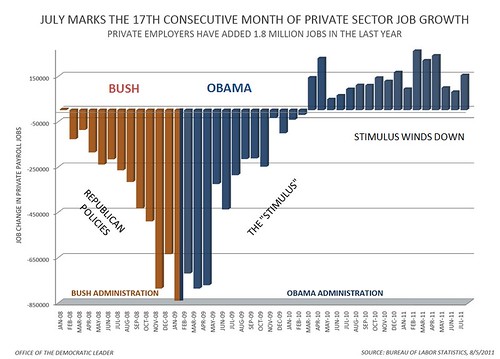
| Three Charts To Email To Your Right-Wing Brother-In-Law |
| Printer Friendly | Permalink | | Top |
| onehandle
|
Mon Aug-29-11 11:48 AM Response to Original message |
| 1. He'll just credit the teabagger takeover, no matter what reality is. nt |
| Printer Friendly | Permalink | | Top |
| MBS
|
Mon Aug-29-11 11:49 AM Response to Original message |
| 2. Excellent |
| Printer Friendly | Permalink | | Top |
| Zebedeo
|
Mon Aug-29-11 11:53 AM Response to Original message |
| 3. In the first chart, 2009 spending including stim is attributed to Bush |
| Printer Friendly | Permalink | | Top |
| mikekohr
|
Mon Aug-29-11 01:51 PM Response to Reply #3 |
| 4. Makes perfect sense to me, this is history repeating itself, R's "F"up D's clean up |
| Printer Friendly | Permalink | | Top |
| fifthoffive
|
Mon Aug-29-11 02:24 PM Response to Reply #3 |
| 5. Huh? |
| Printer Friendly | Permalink | | Top |
| Zebedeo
|
Mon Aug-29-11 03:07 PM Response to Reply #5 |
| 6. In the first chart, |
| Printer Friendly | Permalink | | Top |
| mikekohr
|
Mon Aug-29-11 04:46 PM Response to Reply #6 |
| 7. Source material |
| Printer Friendly | Permalink | | Top |
| DU
AdBot (1000+ posts) |
Thu May 02nd 2024, 12:08 AM Response to Original message |
| Advertisements [?] |
| Top |
| Home » Discuss » General Discussion |
|
Powered by DCForum+ Version 1.1 Copyright 1997-2002 DCScripts.com
Software has been extensively modified by the DU administrators
Important Notices: By participating on this discussion board, visitors agree to abide by the rules outlined on our Rules page. Messages posted on the Democratic Underground Discussion Forums are the opinions of the individuals who post them, and do not necessarily represent the opinions of Democratic Underground, LLC.
Home | Discussion Forums | Journals | Store | Donate
About DU | Contact Us | Privacy Policy
Got a message for Democratic Underground? Click here to send us a message.
© 2001 - 2011 Democratic Underground, LLC
 ?
? ?
?