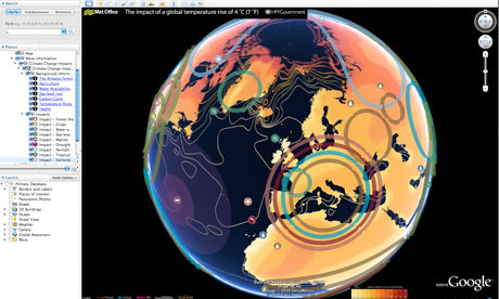
A new interactive Google Earth map was developed using peer-reviewed science from the Met Office Hadley Centre and other leading impact scientists. Photograph: earth.google.co.uk
Think it's hot this summer? Wait until you see Google's simulation of a world with an average global temperature rise of 4C.
Using a map that was first launched by the former Labour administration in October 2009, the coalition government has taken temperature data from the Met Office Hadley Centre and other climate research centres and imposed it on to a Google Earth layer.
It's a timely arrival, with warnings this month that current international carbon pledges will lead to a rise of nearly 4C and the Muir Russell report censuring some climate scientists for not being more open with their data (but exonerating them of manipulating the scientific evidence).
Unlike a similar tool using IPCC data that was launched by Google in the run-up to the Copenhagen climate conference last year, this map will be updated regularly with new data. It also has a series of YouTube videos of experts across the globe, with Met Office staff talking about forest fires in sub-Saharan Africa and researchers at the Tyndall Centre for Climate Change Research explaining sea level rises. To go more in-depth you can follow links to government sites, such as this one on water availability in a warming world.
more
http://www.guardian.co.uk/environment/blog/2010/jul/14/google-climate-data