| Latest | Greatest | Lobby | Journals | Search | Options | Help | Login |
|
|
|
This topic is archived. |
| Home » Discuss » DU Groups » Arts & Entertainment » Photography Group |
|
| JeffR
|
Sun Jan-18-09 02:16 AM Original message |
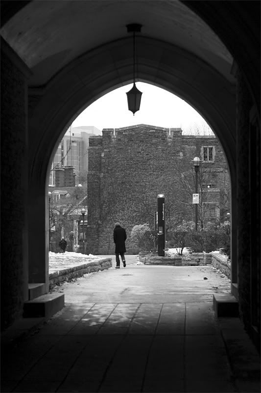
| Two-ish black & whites and a question for everyone: |
| Printer Friendly | Permalink | | Top |
| pipoman
|
Sun Jan-18-09 08:29 AM Response to Original message |
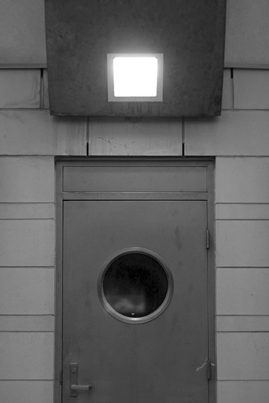
| 1. I like the second too |
| Printer Friendly | Permalink | | Top |
| JeffR
|
Sun Jan-18-09 05:44 PM Response to Reply #1 |
| 10. Great idea, pipoman. |
| Printer Friendly | Permalink | | Top |
| Richard D
|
Sun Jan-18-09 10:42 AM Response to Original message |
| 2. I prefer the first. |
| Printer Friendly | Permalink | | Top |
| JeffR
|
Sun Jan-18-09 05:54 PM Response to Reply #2 |
| 11. Thanks. That does mark a big difference between the two versions. |
| Printer Friendly | Permalink | | Top |
| Blue_In_AK
|
Sun Jan-18-09 01:14 PM Response to Original message |
| 3. They're both very nice renditions, |
| Printer Friendly | Permalink | | Top |
| JeffR
|
Sun Jan-18-09 05:54 PM Response to Reply #3 |
| 12. Does seem appropriately metaphorical these days. |
| Printer Friendly | Permalink | | Top |
| Blue_In_AK
|
Sun Jan-18-09 06:18 PM Response to Reply #12 |
| 17. We're just full of metaphors, aren't we? |
| Printer Friendly | Permalink | | Top |
| Adsos Letter
|
Sun Jan-18-09 01:28 PM Response to Original message |
| 4. I prefer the first... |
| Printer Friendly | Permalink | | Top |
| JeffR
|
Sun Jan-18-09 05:57 PM Response to Reply #4 |
| 13. Your edit comment makes a lot of sense. |
| Printer Friendly | Permalink | | Top |
| Adsos Letter
|
Sun Jan-18-09 01:40 PM Response to Original message |
| 5. On a lighter note... |
| Printer Friendly | Permalink | | Top |
| Blue_In_AK
|
Sun Jan-18-09 02:47 PM Response to Reply #5 |
| 6. Maybe it's one of those huge rodents -- what do they call them? |
| Printer Friendly | Permalink | | Top |
| WannaJumpMyScooter
|
Sun Jan-18-09 03:33 PM Response to Reply #5 |
| 7. shhh, it's okay... I see it too |
| Printer Friendly | Permalink | | Top |
| Adsos Letter
|
Sun Jan-18-09 07:53 PM Response to Reply #7 |
| 19. AND IT HAS A SNAGGLETOOTH!!! |
| Printer Friendly | Permalink | | Top |
| JeffR
|
Sun Jan-18-09 05:59 PM Response to Reply #5 |
| 14. When Nancy looked at it, she thought it was a topless woman. |
| Printer Friendly | Permalink | | Top |
| Blue_In_AK
|
Sun Jan-18-09 06:19 PM Response to Reply #14 |
| 18. I can kind of see that, too... |
| Printer Friendly | Permalink | | Top |
| Mira
|
Sun Jan-18-09 05:29 PM Response to Original message |
| 8. So it's a Hamster - I thought it was rotating laundry. About the preference: |
| Printer Friendly | Permalink | | Top |
| JeffR
|
Sun Jan-18-09 06:01 PM Response to Reply #8 |
| 15. Good suggestion, thanks. |
| Printer Friendly | Permalink | | Top |
| dbmk
|
Sun Jan-18-09 05:37 PM Response to Original message |
| 9. The second |
| Printer Friendly | Permalink | | Top |
| JeffR
|
Sun Jan-18-09 06:02 PM Response to Reply #9 |
| 16. The DOF was inappropriate for the shot, I guess. |
| Printer Friendly | Permalink | | Top |
| Adsos Letter
|
Sun Jan-18-09 09:48 PM Response to Original message |
| 20. You know...I can see the topless woman now... |
| Printer Friendly | Permalink | | Top |
| sandnsea
|
Mon Jan-19-09 02:27 AM Response to Original message |
| 21. First I liked the second one, |
| Printer Friendly | Permalink | | Top |
| ConsAreLiars
|
Mon Jan-19-09 02:58 AM Response to Original message |
| 22. The first, definitely |
| Printer Friendly | Permalink | | Top |
| Tindalos
|
Mon Jan-19-09 10:09 AM Response to Original message |
| 23. The first one. Maybe. |
| Printer Friendly | Permalink | | Top |
| DU
AdBot (1000+ posts) |
Thu May 02nd 2024, 04:17 PM Response to Original message |
| Advertisements [?] |
| Top |
| Home » Discuss » DU Groups » Arts & Entertainment » Photography Group |
|
Powered by DCForum+ Version 1.1 Copyright 1997-2002 DCScripts.com
Software has been extensively modified by the DU administrators
Important Notices: By participating on this discussion board, visitors agree to abide by the rules outlined on our Rules page. Messages posted on the Democratic Underground Discussion Forums are the opinions of the individuals who post them, and do not necessarily represent the opinions of Democratic Underground, LLC.
Home | Discussion Forums | Journals | Store | Donate
About DU | Contact Us | Privacy Policy
Got a message for Democratic Underground? Click here to send us a message.
© 2001 - 2011 Democratic Underground, LLC