Democratic Underground Latest Greatest Lobby Journals Search Options Help Login
Google

What's the best world map projection? [long]

Printer-friendly format Printer-friendly format
Printer-friendly format Email this thread to a friend
Printer-friendly format Bookmark this thread
This topic is archived.
Home » Discuss » Topic Forums » Science Donate to DU
 
pokerfan Donating Member (1000+ posts) Send PM | Profile | Ignore Fri Apr-03-09 02:45 PM
Original message
Poll question: What's the best world map projection? [long]
Maps are a passion for me probably because I'm a nerd. I've got hundreds of them. Technically, all maps are wrong as they are two dimensional representations of a three dimensional surface and there is no way to do that without introducing error. But some maps are better than others. To be fair, some maps are better than others for some purposes. But this is more a question of what is the best general purpose map, the map that should hang in schools or shown on the nightly news.

Here's a clip from a second season West Wing episode, which aired this morning on Bravo which gave me the inspiration for this post.

http://www.youtube.com/watch?v=n8zBC2dvERM">What do mapmakers have to do with social equality? (YouTube 3:49)

And here's a transcript:
________________________________________________

FALLOW: Plain and simple, we'd like President Bartlet to aggressively support legislation that would make it mandatory for every public school in America to teach geography using the Peters Projection Map instead of the traditional Mercator.

JOSH: Give me 200 bucks and it's done.

HUKE: Really?

C.J.: No. Why are we changing maps?

DR. CYNTHIA SAYLES: Because, C.J., the Mercator Projection has fostered European imperialist attitudes for centuries and created an ethnic bias against a Third World.

C.J.: Really?

Fallow brings the map up on the projector.

FALLOW: The German cartographer, Mercator, originally designed this map in 1569 as a navigational tool for European sailors.

HUKE: The map enlarges areas at the poles to create straight lines of constant bearing or geographic direction.

CYNTHIA SAYLES: So, it makes it easier to cross an ocean.

FALLOW: But...

C.J.: Yes?

FALLOW: It distorts the relative size of nations and continents.

C.J.: Are you saying the map is wrong?

FALLOW: Oh, dear, yes. Uh, look at Greenland.

C.J.: Okay...

FALLOW: Now look at Africa.

C.J.: Okay...

FALLOW: The two landmasses appear to be roughly the same size.

C.J.: Yes.

FALLOW: Would it blow your mind if I told you that Africa is in reality fourteen times larger?

Josh nudges C.J. with his knee, C.J. pushes him back.

C.J.: Yes.

SAYLES: Here we have Europe drawn considerably larger than South America when at 6.9 million square miles South America is almost double the size of Europe's 3.8 million.

HUKE: Alaska appears three times as large as Mexico, when Mexico is larger by 0.1 million square miles.

SAYLES: Germany appears in the middle of the map when it's in the northernmost quarter of the Earth.

JOSH: Wait, wait. Relative size is one thing, but you're telling me that Germany isn't where we think it is?

FALLOW: Nothing's where you think it is.

C.J.: Where is it?

FALLOW: I'm glad you asked. The Peters Projection.

C.J. and Josh lean forward.

SAYLES: It has fidelity of axis.

HUKE: Fidelity of position.

SAYLES: East-west lines are parallel and intersect north-south axes at right angles.

C.J.: What the hell is that?

FALLOW: It's where you've been living this whole time. Should we continue?

JOSH: Uh-huh.

(cut to a later scene...)

FALLOW: So, uh... You're probably wondering what all this has to do with social equality?

C.J.: No. I'm wondering where France really is.

Josh joins C.J., standing.

JOSH: Guys, we want to thank you very much for coming in...

C.J.: Hang on. We're going to finish this.

JOSH: Okay.

HUKE: What do maps have to do with social equality, you ask?

JOSH: She asked.

HUKE: Salvatore Natoli of the National Council for Social Studies argues "In our society we unconsciously equate size with importance, and even power".

Josh and C.J. exchange looks.

JOSH: I'm going to check in on Toby.

C.J.: Go.

JOSH: These guys find Brigadoon on that map you'll call me, right?

C.J.: Probably not.

JOSH: Okay.

FALLOW: When Third World countries are misrepresented they're likely to be valued less. When Mercator maps exaggerate the importance of Western civilization, when the top of the map is given to the northern hemisphere and the bottom is given to the southern... then people will tend to adopt top and bottom attitudes.

C.J.: But... wait. How... Where else could you put the Northern Hemisphere but on the top?

SAYLES: On the bottom.

C.J.: How?

FALLOW: Like this.

The map is flipped over.

C.J.: Yeah, but you can't do that.

FALLOW: Why not?

C.J.: 'Cause it's freaking me out.
________________________________________________


I personally like the Robinson but that might be just because National Geographic sent me one years ago. Even though it sacrifices lat-long orthogonality, I think it's a fair compromise between.

Please don't choose 'other' if you're going to suggest upside down. Upside down is not a projection; it's a way of hanging a map. You still have to pick a projection. :)

A globe is obviously the best of all choices. Especially one that is free standing that you can remove from its stand. I have three such globes in my house (Earth, Moon, Mars) but that's only because I'm a nerd.

Your choices are....


http://en.wikipedia.org/wiki/Mercator_projection">Mercator:


http://en.wikipedia.org/wiki/Robinson_projection">Robinson:


http://en.wikipedia.org/wiki/Gall-Peters_projection">Gail-Peters:


http://en.wikipedia.org/wiki/Cassini_projection">Cassini:


http://en.wikipedia.org/wiki/Dymaxion_projection">Dymaxion:


http://en.wikipedia.org/wiki/Equirectangular">Equirectangular:


http://en.wikipedia.org/wiki/Mollweide_projection">Mollweide:


http://en.wikipedia.org/wiki/Winkel_Tripel_projection">Winkel-tripel:


http://en.wikipedia.org/wiki/Globe">A globe:


(This took a while to put together so if you enjoyed reading it, please don't forget to recommend!)
Printer Friendly | Permalink |  | Top
MineralMan Donating Member (1000+ posts) Send PM | Profile | Ignore Fri Apr-03-09 02:56 PM
Response to Original message
1. All of the classrooms in my grammar school had a 24" dia. globe
up in front by the teacher's desk. It's the only decent representation. It gave us all a true look at the land and sea areas of our planet.

I remember in the early grades going up and spinning the globe, then stopping it with a finger. After that, I'd look at whatever my finger was on and look it up in the encyclopedia, which was also in every classroom.

Cool beans!
Printer Friendly | Permalink |  | Top
 
pokerfan Donating Member (1000+ posts) Send PM | Profile | Ignore Fri Apr-03-09 03:14 PM
Response to Reply #1
2. Globes are the best
The only disadvantage is that even a 24" globe can't have the detail of a 10' x 6' hanging wall map.

A 32" would be nice: http://theglobestore.com/diplomat.aspx


Search the world over and you will not find a better example of the globe making art. A handcrafted masterpiece, this extraordinary globe features lavish attention to both form and function. Distinctive details include touch-on illumination, rich ten-color cartography and a solid brass, hand-engraved meridian. The hand-carved, genuine mahogany cradle mounting rubbed to a lustrous walnut finish further emphasizes the DIPLOMAT's uncommon beauty. An expansive 32" diameter globe ball featuring over 20,000 place names, rank it among the world's most detailed globes. A perfect blend of the aesthetic and functional. Ships via Freight in 2 cartons.
Diameter: 32" Width: 40" Height: 51" Weight: 64.5 lbs.

Yikes. You do not want to know the price. Probably due to the fact that it's hand crafted.
Printer Friendly | Permalink |  | Top
 
MineralMan Donating Member (1000+ posts) Send PM | Profile | Ignore Fri Apr-03-09 03:24 PM
Response to Reply #2
3. The only problem with the globe at our school was that it was
a political-oriented map, rather than a geographically-oriented map. Still, hitting places like Zanzibar with my finger led me off into all sorts of things. I went from the encyclopedia to the library. Still, I think I was about the only kid in those classrooms who found any interest in the map.
Printer Friendly | Permalink |  | Top
 
pokerfan Donating Member (1000+ posts) Send PM | Profile | Ignore Fri Apr-03-09 05:23 PM
Response to Reply #3
9. An electronic globe could be cool
Imagine an electronic display in the form of sphere. You could control what elements you want to see (physical, political, demographical, etc.) It could be updated as things change. You could even use it display the Moon, Mars or whatever planet you wish, kinda like GoogleMars.

Here's and http://encarta.msn.com/encnet/features/mapcenter/map.aspx">online globe that you can rotate and zoom:

http://encarta.msn.com/encnet/features/mapcenter/map.aspx">

Greenland and Africa the same size? Yeah, right. :)
Printer Friendly | Permalink |  | Top
 
Posteritatis Donating Member (1000+ posts) Send PM | Profile | Ignore Mon Aug-24-09 05:43 PM
Response to Reply #9
27. My dream toy would be an e-globe with a timeline slider. (nt)
Printer Friendly | Permalink |  | Top
 
Posteritatis Donating Member (1000+ posts) Send PM | Profile | Ignore Fri Apr-03-09 03:37 PM
Response to Original message
4. I loved that scene
"Cause it's freaking me out" made it.

There's a cafe in town I go to now and then that has a big map of the planet posted upside down; people always doubletake seeing it for the first time.
Printer Friendly | Permalink |  | Top
 
pokerfan Donating Member (1000+ posts) Send PM | Profile | Ignore Fri Apr-03-09 04:50 PM
Response to Reply #4
5. Me too
It's a little burrito shop downtown. The labels are printed such that the map is intended to be mounted upside down. Like this:


Printer Friendly | Permalink |  | Top
 
Posteritatis Donating Member (1000+ posts) Send PM | Profile | Ignore Fri Apr-03-09 04:51 PM
Response to Reply #5
6. Ha! I think that's the same map (nt)
Printer Friendly | Permalink |  | Top
 
pokerfan Donating Member (1000+ posts) Send PM | Profile | Ignore Fri Apr-03-09 05:10 PM
Response to Reply #6
7. "I always like going south. Somehow it feels like going downhill."

Printer Friendly | Permalink |  | Top
 
Dead_Parrot Donating Member (1000+ posts) Send PM | Profile | Ignore Fri Apr-03-09 05:12 PM
Response to Original message
8. Globe, but...
...they're a pain in the arse to nail to a wall. Equirectangular gets my vote for a pinned-up quick reference map, although a 50" touch-screen LCD hooked up to Google Earth would be nice... :freak:
Printer Friendly | Permalink |  | Top
 
laconicsax Donating Member (1000+ posts) Send PM | Profile | Ignore Fri Apr-03-09 06:09 PM
Response to Original message
10. Globes are by far the best.
Winkel tripel is the best looking flat projection I've seen.
Printer Friendly | Permalink |  | Top
 
eppur_se_muova Donating Member (1000+ posts) Send PM | Profile | Ignore Fri Apr-03-09 06:24 PM
Response to Original message
11. I favor the Dymaxion, because it can be re-assembled in various ways ...
and it is easy to cut/punch out of sheet plastic or card stock and fold into an icosahdron or cuboctahedron, thus providing a cheap and easily stowed 'globe'.

Fuller claimed his map had several advantages over other projections for world maps.

It has less distortion of relative size of areas, most notably when compared to the Mercator projection; and less distortion of shapes of areas, notably when compared to the Gall-Peters projection. Other compromise projections attempt a similar trade-off.

More unusually, the Dymaxion map has no "right way up". Fuller frequently argued that in the universe there is no "up" and "down", or "north" and "south": only "in" and "out".<2> Gravitational forces of the stars and planets created "in", meaning 'towards the gravitational center', and "out", meaning "away from the gravitational center". He linked the north-up-superior/south-down-inferior presentation of most other world maps to cultural bias.

There is no one "correct" view of the Dymaxion map. Peeling the triangular faces of the icosahedron apart in one way results in an icosahedral net that shows an almost contiguous land mass comprising all of earth's continents - not groups of continents divided by oceans. Peeling the solid apart in a different way presents a view of the world dominated by connected oceans surrounded by land.


(GMTA -- http://www.democraticunderground.com/discuss/duboard.php?az=show_mesg&forum=389&topic_id=5365138&mesg_id=5365863 )
Printer Friendly | Permalink |  | Top
 
tridim Donating Member (1000+ posts) Send PM | Profile | Ignore Fri Apr-03-09 06:36 PM
Response to Original message
12. Other: Google Earth
Edited on Fri Apr-03-09 06:36 PM by tridim
Preferably viewed on a big touch screen monitor.
Printer Friendly | Permalink |  | Top
 
Shanti Mama Donating Member (625 posts) Send PM | Profile | Ignore Sat Apr-04-09 01:31 AM
Response to Original message
13. I want to vote for both the globe and another
And I'd like to see the Pacific ocean in the middle. Even though this "wastes space" I think it gives a better sense of what the earth is composed of.

I live in Asia and we have a Pacific-centered map. It helps me to appreciate the amount of water on earth.

I guess preferences depend purpose.
Printer Friendly | Permalink |  | Top
 
eppur_se_muova Donating Member (1000+ posts) Send PM | Profile | Ignore Sat Apr-04-09 06:09 PM
Response to Reply #13
14. One of the features of the Dymaxion ...
Printer Friendly | Permalink |  | Top
 
mainegreen Donating Member (1000+ posts) Send PM | Profile | Ignore Sat Apr-04-09 08:44 PM
Response to Original message
15. Dymaxion! Plus I love the West Wing. What a great show.
So smart.
Printer Friendly | Permalink |  | Top
 
BlooInBloo Donating Member (1000+ posts) Send PM | Profile | Ignore Sat Apr-04-09 11:57 PM
Response to Original message
16. (shrug) As a mathematical issue, they all have trade-offs...
It's unfortunate you (and others) don't know the difference between *a projection* and *where that project is "centered"*, naturally.

But as far as globe --> plane projections are concerned, it isn't possible to continuously project, preserving ALL characteristics that we might like. If I recall correctly, the biggest choice is a) preserving angles versus b) preserving areas.

But it's been 5+ years since I've looked at that particular aspect of calculus/jacobians.
Printer Friendly | Permalink |  | Top
 
pokerfan Donating Member (1000+ posts) Send PM | Profile | Ignore Sun Apr-05-09 10:32 AM
Response to Reply #16
19. *I* don't know the difference?
Oh, thank you so very much for that!
Printer Friendly | Permalink |  | Top
 
Apianus Donating Member (2 posts) Send PM | Profile | Ignore Mon Aug-24-09 05:14 PM
Response to Reply #16
26. What is the best world map projection

The globe shouldn't be included in the poll, because it isn't a map projection. It's a model.

The best general-purpose world map projection, especially for introductory purposes, is Apianus II. As you can see, I've borrowed Apianus's name as my username. Apianus II was first proposed in the 1500s. "Apianus" was a pseudonym of its proponent.

Apianus II is an elliptical world map, like the Mollweide, but much simpler in its construction, and with more realistically-shaped continents. Here's its simple construction:

The map's boundary is an ellipse. The parallels are straight horizontal equally-spaced lines. Their length, obviously, is determined by the width of the ellipse. The scale is uniform along each parallel, and so the meridians intersect each parallel at equally spaced points along each parallel. The distance separating the parallels, measured perpendicular to the parallels, is correct, according to the scale along the equator.

In other words, Apianus has the most simple and obvious construction of any elliptical world map.

Some advantages of Apianus II:

1. Simplicity of construction. Unlike Mollweide, Apianus II's construction can be easily completely explained to anyone, including students in any grade.

2. Linearity: vertical distance on the map is proportional to latitude-difference. Horizontal distance on the map is proportional to longitude-difference. That makes it much easier to measure or find latitude/longitude co-ordinates of points on the map. That's important for any map showing data, such as species habitat ranges, land-use, vegetation, temperatures, etc.

3. Because it's an elliptical projection, it shows the Earth with a realistic round shape, and the meridians realistically converge at the polls. And, for those reasons, it avoids the distortions of area or shape possessed by flat-polar maps.

I suggest that Apianus II is the best choice for the first world map that students encounter in a classroom, and the best general purpose world map for atlases, thematic maps, etc.

Yes, other projections can be better for specific special purposes. For instance, the Sinusoidal projection is the simplest and most natural equal-area projection, useful for certain data-maps for which area is considered important. Because of its sheer-distortion, the Sinusoidal is best used in "interrupted" form. The Sinusoidal differs from Apianus II in that the lengths of the parallels, as well as their separation are correct and true, in terms of the scale along the equator. That results in a natural equal area projection.


I claim that "equal-area" is much overrated. Apianus II's areas aren't blatantly off, except for Antarctica.


Printer Friendly | Permalink |  | Top
 
TechBear_Seattle Donating Member (1000+ posts) Send PM | Profile | Ignore Sun Apr-05-09 01:38 AM
Response to Original message
17. What will the map be used for?
Each projection has its strengths and weaknesses. For general use, I like the Albers (conic) projection. I've also seen some pseudocylindrical projections that were nice; that is where, instead of a rectangular projection, you get one that looks like the surface of a globe has been peeled into sections showing individual continents.
Printer Friendly | Permalink |  | Top
 
pokerfan Donating Member (1000+ posts) Send PM | Profile | Ignore Sun Apr-05-09 10:31 AM
Response to Reply #17
18. From the OP
"But this is more a question of what is the best general purpose map, the map that should hang in schools or shown on the nightly news."
Printer Friendly | Permalink |  | Top
 
sakabatou Donating Member (1000+ posts) Send PM | Profile | Ignore Sun Apr-05-09 12:39 PM
Response to Reply #18
20. Hey pokerfan
Your signature wouldn't be from "Sinfest," would it?
Printer Friendly | Permalink |  | Top
 
pokerfan Donating Member (1000+ posts) Send PM | Profile | Ignore Sun Apr-05-09 12:58 PM
Response to Reply #20
21. why yes it would
Edited on Sun Apr-05-09 12:59 PM by pokerfan
but the quote is from Calvin and Hobbes.

:hi:
Printer Friendly | Permalink |  | Top
 
sakabatou Donating Member (1000+ posts) Send PM | Profile | Ignore Sun Apr-05-09 04:05 PM
Response to Reply #21
22. OK
Printer Friendly | Permalink |  | Top
 
Nihil Donating Member (1000+ posts) Send PM | Profile | Ignore Mon Apr-06-09 05:45 AM
Response to Original message
23. Other ...
Another vote for the "peeled globe" ... everything is accurately
proportioned as there is no stretching/filling required.
The only continuous surface is along the equator so you can't
navigate easily using this format but it gives a good impression
of where things are and how big (relatively) they are.
:hi:
Printer Friendly | Permalink |  | Top
 
amyrose2712 Donating Member (1000+ posts) Send PM | Profile | Ignore Mon Apr-06-09 08:40 AM
Response to Original message
24. All these maps are giving me a warm fuzzy feeling...
:crazy: :crazy: I think the globe is the best, but I also like the Dymaxion also, although have never used one. I am also a map nerd. I am working on a BS in Environmental Science with a certificate in Geographic Information Systems.
Printer Friendly | Permalink |  | Top
 
emmadoggy Donating Member (1000+ posts) Send PM | Profile | Ignore Mon Apr-06-09 08:47 AM
Response to Original message
25. I remember that West Wing scene...
Love Allison Janney - love the "freaking me out" line.

I vote globe, but I like the Mollweide or Winkel-tripel too.
Printer Friendly | Permalink |  | Top
 
Apianus Donating Member (2 posts) Send PM | Profile | Ignore Thu Sep-03-09 07:58 PM
Response to Original message
28. The Mollweide projection
This is posting is from username Apianus. I mention that because I might have accidentally deleted my username.

Though I claim, as I said in my other posting, that Apianus II is the best general purpose world map projection, and by far the best introductory world map, for classrooms and atlases, etc., Mollweide may be a close 2nd in some respects:

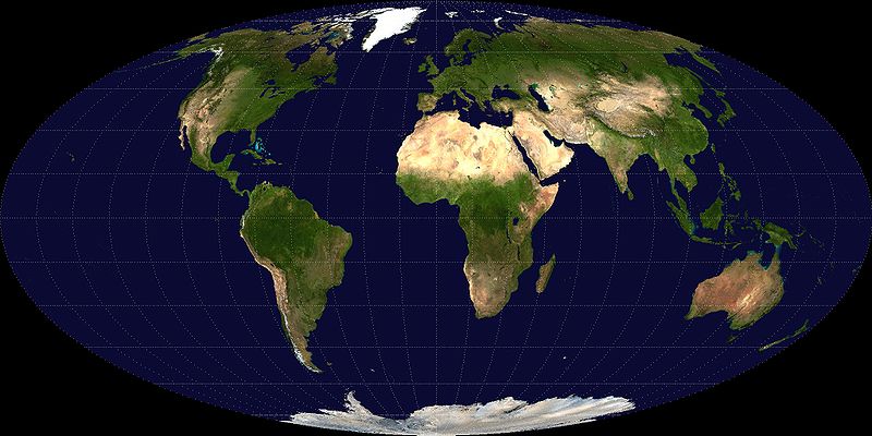
Like Apianus II, Mollweide is an elliptical world map, showing the Earth with realistic round shape, with meridians that realistically converge at the polls. And, as with Apianus, that's good for continent shapes.

Why Mollweide isn't as good as Apianus II:

Look at Africa on a Mollweide map. It's blatantly unrealistically skinny. That stands out. And, in fact, in general, equal-area (Mollweide is an equal-area projection) tends to worsen shapes and distances.

I consider distance and shape to be more important on a map than area.

The area of a country or continent is no measure of its importance, of the size of its economy or popululation, of its resources, etc. The area of a country matters little. On the contrary, distances do matter. And, aesthetically, the shapes on a map matter.

Of course it can be aesthetically unappealing, and misleading for small children, if areas are strongly out of proportion. But, as I said in my other posting, Apianus II's areas aren't blatantly off, except for Antarctica.

In general, an equal area map tends to square the maximum scale-variation. When that scale variation factor differs a lot from the number one, as it tends to on a world map, squaring the maximum scale variation factor considerably more than doubles the maximum percentage scale variation.

Mollweide, then, by being an equal-area map, unduly distorts distances.

What about the other popular elliptical world map, "Hammer". (It should be, and often is, called "Hammer-Aitoff")?

Hammer at first looks better than Mollweide, because Africa has a better shape. But, when the map is centered on the Grenwich Meridian, look at Japan, Australia and New Zealand: Those 3 countries get a lot worse treatment, shape-wise, from elliptical maps than Africa does (with Greenwich centering). And so what happens to their shape on the map, I claim, matters more. Mollweide doesn't distort those 3 countries' shape as badly as Hammer does.

On the other hand, it might be that Hammer, due to the symmetrical nature of its construction, has less maximum scale variation. I don't know.

But Mollweide has another advantage over Hammer: Mollweide's construction, while not nearly as simple and natural as that of Apianus II, can at least be explained more easily than the construction of Hammer.

How to explain Mollweide's construction:

Start by mentioning Sinusoidal:

If, as with the Sinusoidal projection, the parallels are equally-spaced horizontal straight lines, with the correct length in proportion to eachother--in other words, with the same uniform scale along all parallels, and with parallels correctly spaced according to that same scale, then all areas on the map are in correct proportion, automatically.

That results in the rather diamond-shaped Sinusoidal projection. It has a disconcerting amount of shear distortion, and so it's best shown in interrupted form. But for this comparison, consider the un-interrupted diamond-shaped form. Young people wonder why the earh should be portrayed with a diamond shape, when a round shape would be more realistic. That's one reason to use an elliptical projection. But if the parallels are bounded by an ellipse, as the map's shape (giving you Apianus II), then their lengths are no longer in the right proportion to eachother, and so the map is no longer equal-area.

How to restore equal area to that elliptical map? Change the spacing of the parallels. At any particular latitude, the parallel is somewhat too long, because it's extended out to the elliptical boundary, instead of having the shorter length that Sinusoidal would give it. So, then, since a band of land along any particular parallel is too long east-west, then shorten its north-south dimension. Shorten the north-souths scale at that parallel, to counter the greater east-west scale due to the long parallel.

Mollweide could be constructed by that numerical process, even though it's done differently in practice.

I don't know how many school students would listen to this explanation, or at what grade you could give this explanation. But Hammer's construction requires spherical co-ordinate transformations, and therefore couldn't really be completely explained to an audience that didn't want to study them.

Mike Ossipoff
Printer Friendly | Permalink |  | Top
 
Dr. Strange Donating Member (1000+ posts) Send PM | Profile | Ignore Fri Sep-04-09 09:38 AM
Response to Original message
29. The globe is the best.
But if you're going to project it onto a piece of paper (i.e. make a map), then you're going to have to give up something. While the plane and the sphere are homeomorphic (minus a "point at infinity"), no homeomorphism will preserve all the stuff we like (such as distance, area, and direction). Personally, I like either the Mercator or Equirectangular maps.

By the way, Cartographers for Social Equality is apparently on the Facebook: http://apps.facebook.com/causes/17188

Hooray for getting to use the word "homeomorphic!"
Printer Friendly | Permalink |  | Top
 
DU AdBot (1000+ posts) Click to send private message to this author Click to view 
this author's profile Click to add 
this author to your buddy list Click to add 
this author to your Ignore list Thu May 02nd 2024, 09:32 AM
Response to Original message
Advertisements [?]
 Top

Home » Discuss » Topic Forums » Science Donate to DU

Powered by DCForum+ Version 1.1 Copyright 1997-2002 DCScripts.com
Software has been extensively modified by the DU administrators


Important Notices: By participating on this discussion board, visitors agree to abide by the rules outlined on our Rules page. Messages posted on the Democratic Underground Discussion Forums are the opinions of the individuals who post them, and do not necessarily represent the opinions of Democratic Underground, LLC.

Home  |  Discussion Forums  |  Journals |  Store  |  Donate

About DU  |  Contact Us  |  Privacy Policy

Got a message for Democratic Underground? Click here to send us a message.

© 2001 - 2011 Democratic Underground, LLC