Democratic Underground Latest Greatest Lobby Journals Search Options Help Login
Google

Map Reveals Stark Divide in Who Caused Climate Change and Who's Being Hit

Printer-friendly format Printer-friendly format
Printer-friendly format Email this thread to a friend
Printer-friendly format Bookmark this thread
Home » Discuss » Topic Forums » Environment/Energy Donate to DU
 
polly7 Donating Member (1000+ posts) Send PM | Profile | Ignore Fri Oct-28-11 03:40 PM
Original message
Map Reveals Stark Divide in Who Caused Climate Change and Who's Being Hit
http://www.commondreams.org/headline/2011/10/28-0

Published on Friday, October 28, 2011 by The Guardian/UK

Map Reveals Stark Divide in Who Caused Climate Change and Who's Being Hit

by Damian Carrington


When the world's nations convene in Durban in November in the latest attempt to inch towards a global deal to tackle climate change, one fundamental principle will, as ever, underlie the negotiations.

Is is the contention that while rich, industrialised nations caused climate change through past carbon emissions, it is the developing world that is bearing the brunt. It follows from that, developing nations say, that the rich nations must therefore pay to enable the developing nations to both develop cleanly and adapt to the impacts of global warming.

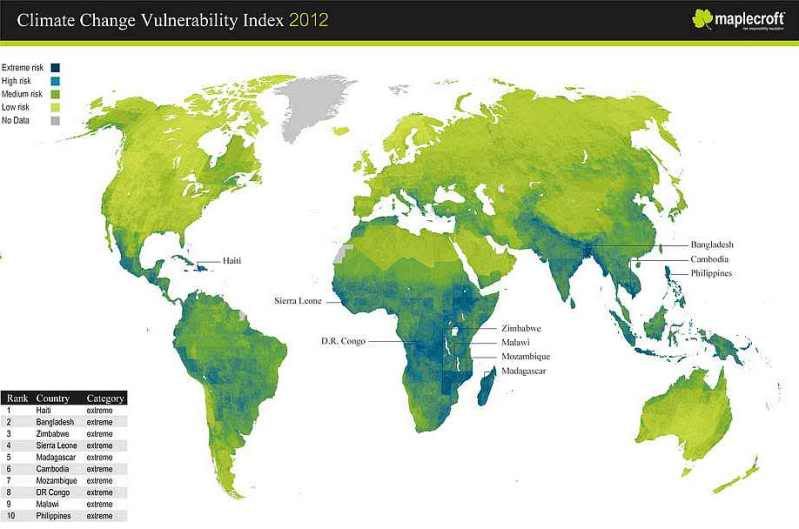
The point is starkly illustrated in a new map of climate vulnerability (above): the rich global north has low vulnerability, the poor global south has high vulnerability. The map is produced by risk analysts Maplecroft by combining measures of the risk of climate change impacts, such as storms, floods, and droughts, with the social and financial ability of both communities and governments to cope. The top three most vulnerable nations reflect all these factors: Haiti, Bangladesh, Zimbabwe.

Refresh | +6 Recommendations Printer Friendly | Permalink | Reply | Top
jwirr Donating Member (1000+ posts) Send PM | Profile | Ignore Fri Oct-28-11 04:52 PM
Response to Original message
1. This is a very good map but we need a second map - one that shows
contributors to the problem. There is a difference between being vulnerable and contributing. I had not realized that the effects were so north-south oriented. Why is this so evident? You would think that it would be equally distributed around the world.
Printer Friendly | Permalink | Reply | Top
 
Geoff R. Casavant Donating Member (1000+ posts) Send PM | Profile | Ignore Fri Oct-28-11 05:29 PM
Response to Reply #1
2. It's not quite north-south
It's that equatorial areas are more affected. Australia, for example, has about the same risk as North America. Without Antartica in the picture it's tough to remember that the equator goes through the middle of Africa and the northern part of South America.
Printer Friendly | Permalink | Reply | Top
 
jwirr Donating Member (1000+ posts) Send PM | Profile | Ignore Fri Oct-28-11 05:58 PM
Response to Reply #2
3. Thank you.
Printer Friendly | Permalink | Reply | Top
 
DU AdBot (1000+ posts) Click to send private message to this author Click to view 
this author's profile Click to add 
this author to your buddy list Click to add 
this author to your Ignore list Tue May 07th 2024, 02:58 PM
Response to Original message
Advertisements [?]
 Top

Home » Discuss » Topic Forums » Environment/Energy Donate to DU

Powered by DCForum+ Version 1.1 Copyright 1997-2002 DCScripts.com
Software has been extensively modified by the DU administrators


Important Notices: By participating on this discussion board, visitors agree to abide by the rules outlined on our Rules page. Messages posted on the Democratic Underground Discussion Forums are the opinions of the individuals who post them, and do not necessarily represent the opinions of Democratic Underground, LLC.

Home  |  Discussion Forums  |  Journals |  Store  |  Donate

About DU  |  Contact Us  |  Privacy Policy

Got a message for Democratic Underground? Click here to send us a message.

© 2001 - 2011 Democratic Underground, LLC